7 Sales Dashboard Examples (30 Reports) + How to Build Them
Let’s get you some sales insights 💡
Want to start building sales dashboards but don’t know where to begin? 🤔
We’ve broken down a relatively comprehensive set of sales KPIs/metrics into 7 separate sales dashboards. Every dashboard comes with example reports plus more details on why they’re important.
For those who are using Salesflare or looking to use it, we’ll detail which reports are built-in and which can be custom-built. 👷♂️
Here are the 7 sales dashboards we’ll explore:
- Lead generation
- Sales forecast
- Sales revenue
- Sales closing performance
- Sales cycle
- Sales activity
- Recurring revenue
You can click to any specific one right away 👆 or start from the beginning below 👇.
Welcome to the wonderful world of sales reporting 🔮
What’s the scope of each sales dashboard?
With our “impressive” PowerPoint skills, we’ve tried to visualize this for you. 👇

In short:
- Lead generation fills our sales pipeline.
- Sales activity pushes your leads through it.
- At the end of the pipeline you close them.
- Measure the duration of your sales cycle to know your speed.
- Forecast your revenue from the pipeline to predict your revenue.
- And then measure your sales revenue (which could be recurring revenue).
Makes sense? 😁 Let’s start digging for insights! ⛏️
1. Lead generation dashboard
Let’s start at the beginning of your sales pipeline. You know 😁, this thing:

If you want to bring in revenue consistently, you need to keep filling it consistently. Our first sales dashboard will help you measure how well you’re doing on that front… and how you’re actually making it happen.
By the way, we are now here:

# New Opportunities (built-in)

The easiest way to track how many leads you’ve generated is to count the amount of new opportunities in your pipeline.
You’ll find this report in Salesflare on the built-in “Revenue” dashboard.
# New Accounts (custom)

If you’re not immediately creating an opportunity for every new lead (which we’d actually recommend to do), an alternative measure you can use is the number of new accounts created.
This report is very simple to build in Salesflare: just report on the “accounts” entity, apply the dashboard time filter to the “creation date”, and use a “scorecard” as the chart type.

Total Value of New Opportunities per Month (custom)

Counting the number of new leads you’re creating is a great way to measure your input and stay motivated. If you also want to know what these new leads represent in terms of total value brought in (and how that evolves over time), then this report comes in handy.
To build it in Salesflare, report on “opportunities” (1), apply the dashboard filter to the “creation date” (2), choose a “column chart” to represent it (3), view by the “opportunity creation date” (x-axis) (4), and measure by the “sum” (5) of the “opportunity value” (y-axis) (6).

Top Lead Sources (built-in, optional)

Now that you know how many leads you bring in and what amount of total value they represent, the question remains: what lead generation tactics are bringing you most leads? 💰
This is why you keep track of the “lead source” of every new opportunity. It’ll give you the insight into what generates you most leads, so you can either double down on what works or explore new ways of generating leads.
As most people don’t track the lead sources and we like to keep things clean in Salesflare, we made it an option that is off by default but fully built-in so you can turn on the field in Settings > Customize fields > Opportunity > Predefined fields whenever you’re ready (more info about this here).
The above report will then automatically pop up in your built-in “Revenue” dashboard.
Total Value of New Opportunities per Lead Source (custom)

This report is a combination of the previous two: it measures the total value of new opportunities, but this time by lead source (and segmented by country).
You can build it in Salesflare as follows: report on “opportunities”, apply the dashboard filter to the “creation date”, choose a “column chart” to represent it, view by the “opportunity lead source” (x-axis), and measure by the “sum” of the “opportunity value” (y-axis).
We have additionally segmented it by “account country” here so we can check how each country is represented (you can hover on the bars in Salesflare to get more info about these segments and how big they are).

2. Sales forecast dashboard
When we know how many leads are generated and how, we can look a bit further in our pipeline and start tracking how much revenue it is expected to produce by creating a sales forecast. 📈

Revenue Forecast: Expected Revenue (built-in)

This report helps you to figure out whether you’ll make the target… or not.
It adds up the revenue you’ve already won and the revenue you’re expecting to close in the current period. This expected revenue is calculated by multiplying the values of the opportunities you’re expecting to close this period with the probabilities that you’ll win them.
While revenue forecasts are included as a feature on the Pro/Professional plan by most small business CRM software, it is offered as a built-in report (in the “Revenue” dashboard) on Salesflare’s lowest priced Growth plan, so everyone can easily take advantage of it.
Expected Revenue from Open Opportunities per Month (custom)

Want to know when you’re expected to close all that revenue? Just view the expected revenue by its expected close date. ⏱️
To build it in Salesflare, report on “opportunities”, apply the dashboard filter to the “close date”, choose a “column chart” to represent it, view by the “opportunity close date” (x-axis), and measure by the “sum” of the “opportunity expected value” (y-axis).
To only include the expected revenue from open opportunities, filter the opportunities by stage too. Exclude won, lost, and any other stage you’ve created behind those.

Expected Revenue by Stage (custom)

If you’re wondering where in your pipeline the revenue potential is hiding, then this report is what you’re looking for. 👀
To build it in Salesflare, you can duplicate the above report and make one tweak: measure by the “opportunity stage”.
To build it from scratch: report on “opportunities”, apply the dashboard filter to the “close date”, choose a “column chart” to represent it, view by the “opportunity stage” (x-axis), and measure by the “sum” of the “opportunity expected value” (y-axis). Then filter (on the right) to only include the first stages.

Expected Revenue per Country (custom)

Finally, if you want to know in which countries you’re expected to make that revenue, you can build this report. 🌍
You can easily duplicate one of the two above reports, change it into a “pie chart” and segment by “account country”.
To build it from scratch: report on “opportunities”, apply the dashboard filter to the “close date”, choose a “pie chart” to represent it, measure by the “sum” of the “opportunity expected value” and segment by “account country”. Then filter (on the right) to only include the first stages.

3. Sales revenue dashboard
So far, we’ve been measuring new leads and forecasting expected revenue. Now it’s time to measure results.

We’ll answer questions like:
- How many deals are we closing?
- Who’s closing them?
- What’s the average value per deal?
- Who are our top customers?
- And what are our top products?
Let’s get started 👇
# Won Opportunities (built-in)

Want to count the amount of opportunities you’ve won? 🔢
This report comes built into the “Revenue” dashboard in Salesflare.
# Won Opportunities by Opportunity Owner per Month (custom)

To see how each person contributes to the number of opportunities won over time, you can build this report.
To do that in Salesflare, report on “opportunities”, apply the dashboard filter to the “close date”, choose a “bar chart” to represent it, measure by the “# opportunities” (x-axis), view by the “opportunity close date” (y-axis), segment by “opportunity owner”, and filter on the “won” stage (right sidebar).

If you want to see the bar segments next to each other instead of stacked, scroll down to the “Advanced options” and uncheck the option “Stack segments”.
Average Value of Won Opportunities (built-in)

What can be interesting to see is how big your deals are on average… and how that’s evolving. 📊
Salesflare shows this report by default in the out-of-the-box “Revenue” dashboard.
Average Value of Won Opportunities by Opportunity Owner (custom)

So you know your average deal size, but you don’t know how that differs across team members. Let’s figure this out! 🤓
To build the report in Salesflare, report on “opportunities”, apply the dashboard filter to the “close date”, choose a “bar chart” to represent it, measure by the “opportunity value” (x-axis), view by the “opportunity owner” (y-axis), and filter on the “won” stage (right sidebar). Done!

Top Earning Accounts: table (built-in)

If you want to know who your best customers are in terms of won revenue in the current period, you need a “top earning accounts” report.
Salesflare shows it by default in the out-of-the-box “Revenue” dashboard.
Top Earning Accounts: bar chart (custom)

You like the above but want to see a chart instead of a table? We hear ya! 🙌
To build this report in Salesflare, report on “opportunities”, apply the dashboard filter to the “close date”, choose a “bar chart” to represent it, measure by the “sum” of the “opportunity value” (x-axis), view by the “account name” (y-axis), and filter on the “won” stage (right sidebar).
Then you get this 👇

Leaderboard (built-in)

If you like to see how well everyone is performing versus their revenue quota, you need a Leaderboard. The team members with the highest total sales compared to quota are typically listed at the top.
Salesflare offers this in the “Team” dashboard. No need to build it yourself.
Revenue per Product (custom)

If you’re selling different products, it can also be handy to separate your revenue by product.
To start doing this, you’ll of course first have to track your revenue by product. In Salesflare, you can just create a custom field named “product” of the type “dropdown”.
Then, to build the report in Salesflare, report on “opportunities”, apply the dashboard filter to the “close date”, choose a “bar chart” to represent it, measure by the “sum” of the “opportunity value” (x-axis), view by your “product” custom field (y-axis), and filter on the “won” stage (right sidebar).
And, boom, there you have it… you can see what your top product is!

4. Sales closing performance dashboard
Let’s zoom in on your closing performance now.

How many of the leads that are newly generated are won? Who is better at closing? And why are they lost? 🤔
Those are some of the important questions we’ll try to answer.
Funnel Analysis
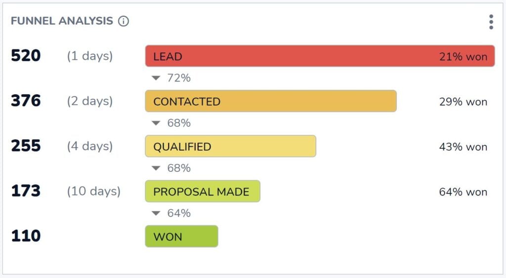
How many opportunities reach the won stage? And how many opportunities do you need in each preceding stage to have that result?
That’s what the indispensable funnel analysis in Salesflare helps you answer. You can find the answers to these essential questions fully out-of-the-box in Salesflare’s “Revenue” dashboard.
Closing Ratio per Team Member (built-in)

If you want to know who’s the most efficient closer, this is the report you’re looking for.
You can find it in the “Team” dashboard in Salesflare.
# Opportunities Won vs Lost per Month (custom)

Now, how does your closing ratio change over time? And to what extent is it dependent on the total amount of opportunities that get to won or lost? Maybe in some months you just have more leads, but not necessarily more qualified ones?
That’s what you can see by reporting on won vs lost opportunities per month.
To build this in Salesflare, report on “opportunities”, apply the dashboard filter to the “close date”, choose a “bar chart” to represent it, measure by the “# opportunities” (x-axis), view by the “opportunity close date” (y-axis), segment by “opportunity stage”, and filter to only show the stages that are “won OR lost” (right sidebar).

Top Lost Reasons (built-in)

Now, let’s dig into the “why”. Why are opportunities lost? That way we know how to improve.
This report comes built into the “Revenue” dashboard in Salesflare. Whenever you mark an opportunity as lost, Salesflare asks what the reason is.
That’s unless you disable the “Lost reason” field in Settings > Customize fields > Opportunities > Predefined fields, but we’d definitely recommend you keep it enabled! This report can be a goldmine for insights.
Top Lost Reasons by Opportunity Owner (custom)

The truth is: different people may record different reasons because of their biases. That’s why it also makes sense to report on the lost reasons by team member.
To build this report in Salesflare, report on “opportunities”, apply the dashboard filter to the “close date”, choose a “bar chart” to represent it, measure by the “# opportunities” (x-axis), view by the “opportunity lost reason” (y-axis), and segment by the “opportunity owner”.

5. Sales cycle dashboard
We’ve analyzed our performance at length now, but what about our speed? 🏎️

How fast are we working these opportunities through the pipeline? Who can close deals faster? And where do they usually get stuck?
Average Sales Cycle Duration (built-in)

What is the length of your sales cycle, aka how long does it take on average from creating an opportunity to closing it as won?
This report in the “Revenue” dashboard in Salesflare answers that exact question.
Average Sales Cycle Duration by Opportunity Owner over Time (custom)

This report sheds light on how quick different team members are at closing deals and how that changes over time.
To build this report in Salesflare, report on “opportunities”, apply the dashboard filter to the “close date”, choose a “bar chart” to represent it, measure by the “average” “opportunity sales cycle” (x-axis), view by the “opportunity close date” (y-axis), and segment by the “opportunity owner”.
After this, uncheck “Stack segments” in the advanced options (scroll to the bottom) as it makes little sense to stack averages.

Funnel Analysis
Didn’t we already see this report before? Yes, we did!
This time we’re not looking at closing performance, but we’re breaking down our sales cycle length by the stages.
You can check out this “funnel analysis” report on the “Revenue” dashboard in Salesflare whenever you want to know how each stage contributes to the total sales cycle length.
6. Sales activity dashboard
Up till now, we’ve been measuring output and performance. Now, let’s measure input aka sales activity! ✉️📞📆

Most Active Teammate (built-in)

Simple question: who’s your most active teammate?
This standard scorecard is built into the “Team” dashboard in Salesflare.
Activity per Teammate: meetings, calls, emails (built-in)

Want to know how that activity breaks down?
Split up the activity per person by emails sent, calls placed, and meetings held with customers.
Salesflare tracks all the above automatically and knows which activity is linked to accounts/customers and which is not.
# Hot Opportunities (custom)

To know how many opportunities crossed a certain interest and activity level, this report can help.
In Salesflare, opportunities are automatically marked as “hot” or “on fire” based on email opens, link clicks, website visits and email activity.
To build a report in Salesflare to count the number of hot leads at all times, report on “opportunities”, apply the dashboard filter to the “close date”, choose a “scorecard” to represent it, measure by the “# opportunities”, and filter by the “account hotness” to only count opportunities linked to “hot OR on fire” accounts.
If you don’t only want to count opportunities with a “close date” in the selected period, scroll down to the advanced options and check “Don’t apply the dashboard time filter”.

7. Subscription revenue dashboard
If you sell subscriptions, a way to report on your subscription revenue is a must-have.

Don’t expect anything too complex from the subscription revenue tracking in a CRM. There’s specialized solutions for this like ProfitWell, ChartMogul and Baremetrics.
Still, it’s great to have some basic subscription revenue reporting in your CRM.
Let’s look at what’s possible. 👇
Monthly Recurring Revenue (MRR) (built-in, optional)

If you’re selling a SaaS product or another type of subscription product or service, your Monthly Recurring Revenue (MRR) growth may be the main thing you’re tracking.
Salesflare has MRR reporting built into the “Revenue” dashboard. To make the report appear, turn on “recurring revenue” on the pipeline as shown below.

MRR per Account (custom)

Last but not least, it can be interesting to figure out what your top accounts are in terms of monthly recurring revenue and how they each contribute.
To build this report in Salesflare, report on “opportunities”, apply the dashboard filter to the “close date”, choose a “bar chart” to represent it, measure by the “sum” of the “opportunity recurring revenue” (x-axis), view by the “account name” (y-axis), and filter by the “stage” to only include “won” opportunities (right sidebar).
Magic ✨

Sales dashboard providers
Want to start building some of the above and unsure what software to use? Here are some of the top sales dashboard providers.
Salesflare
Salesflare doesn’t only make it super easy to build sales dashboards. It also makes it super easy to track the data you’ll base those dashboards on.
The software bases itself on the information that is already there in the sales team’s inboxes, calendars, etc. and makes sure that data is easily tracked. That way you can’t just follow up your leads better and make more revenue, but you can also build dashboards, learn how you’re doing, and improve accordingly.
Standard dashboards that cover the most common needs are available on the Growth plan ($29-35/user/month) and custom dashboards and reports can be found on the Pro plan ($49-55/user/month).
HubSpot
Another CRM system with strong sales dashboarding capabilities is HubSpot. HubSpot offers a comprehensive suite of tools that allow sales teams to create detailed dashboards. These dashboards can track a variety of metrics including sales performance, pipeline management, and customer interactions. HubSpot’s dashboards are highly customizable, allowing users to tailor them to their specific needs.
Sales analytics and forecasting are available on the Sales Hub Professional plan ($90-100/user/month) while features like recurring revenue tracking can only be found on the Sales Hub Enterprise plan (starting at $150/user/month).
Geckoboard
Geckoboard is a dedicated dashboard tool that integrates with various data sources to provide real-time insights. It’s designed to be easy to use, with a drag-and-drop interface that makes dashboard creation straightforward. Geckoboard supports integrations with a wide range of CRM systems, marketing tools, and other data sources, allowing sales teams to monitor KPIs in real time.
Pricing starts at $39-49/month for the Essential plan, which includes core features and integrations, while for CRM integrations and higher data refresh rates you need to move onto the Pro plan ($79-99/month) or Scale plan ($559-699/month).
Microsoft Power BI
Microsoft Power BI is a powerful business analytics tool that provides interactive visualizations and business intelligence capabilities. It allows users to create dashboards that combine data from various sources, including CRM systems, databases, and spreadsheets. Power BI is known for its robust data analysis and visualization capabilities, making it a popular choice for sales teams that need to analyze complex data sets.
The pricing for Power BI starts with the Pro plan at $10/user/month, which includes full self-service BI capabilities, and scales up to the Premium plan (starting at $20/user/month) for advanced analytics and larger scale deployments.
FAQ
What is included in a sales dashboard?
A sales dashboard includes a collection of reports and Key Performance Indicators (KPIs) that visualize your sales activities and performance. It’s typically organized into specific themes, such as a Lead Generation dashboard (tracking new opportunities), a Sales Revenue dashboard (tracking won deals and revenue), and a Sales Forecast dashboard (predicting future income).
How do I create a sales dashboard?
To create a sales dashboard, you typically use a CRM or a dedicated dashboard tool. The process involves building individual reports by selecting the data you want to measure (e.g., opportunities), choosing a chart type (like a bar chart or scorecard), defining what to show on each axis (e.g., value by date), and applying filters (e.g., for a specific time period or sales stage). These reports are then arranged together on a single dashboard view.
What are the 4 types of dashboards?
In business intelligence, dashboards are generally categorized into four main types:
- Strategic Dashboards: Provide a high-level overview of long-term company goals and performance for executives.
- Analytical Dashboards: Used by data analysts to explore data, identify trends, and uncover insights.
- Operational Dashboards: Monitor real-time operational activities to track performance and identify immediate issues. A sales activity dashboard is a great example.
- Tactical Dashboards: Used by mid-level managers to track performance against specific departmental goals and tactics.
How to make a sales report dashboard in Excel?
To create a sales dashboard in Excel, first organize all your sales data into a structured table. From there, you can use Pivot Tables to summarize the data and create various charts (like bar graphs, line charts, and pie charts) from these summaries. Finally, you arrange all these charts onto a single spreadsheet to act as your dashboard. This process is manual and requires you to constantly update the source data.
What is the best CRM for sales dashboards?
The best CRM for sales dashboards is one that not only makes it easy to build reports but also automates the data collection that fuels them. A CRM like Salesflare excels at this because it automatically logs your team’s activities from their emails, calendar, and phone. This ensures that the data in your dashboards is always accurate and up-to-date without requiring manual effort, giving you insights you can trust.
Oof, that was a long list of example sales dashboards (and providers)! 😅 The possibilities are truly endless…
If you made it all the way here, congrats 🙌 We hope you found some good inspiration to build more reports and obtain deeper insights.
Anything else you’d like to build or know? Just ask our team using the chat on salesflare.com. We’re here to help 😄

We hope you liked this post. If you did, spread the word!
👉 You can follow @salesflare on Twitter, Facebook and LinkedIn.
Last updated:
- 8 Best CRMs for Gmail + Top Features - June 25, 2026
- 8 Best CRMs for Startups in 2026 - June 15, 2026
- 8 Best Simple CRMs in 2026 - April 29, 2026