7 esempi di cruscotti di vendita (30 report) + come costruirli
Vi forniamo alcuni spunti di vendita 💡
Volete iniziare a costruire dashboard di vendita ma non sapete da dove cominciare? 🤔
Abbiamo suddiviso una serie relativamente completa di KPI/metriche di vendita in 7 dashboard di vendita separati. Ogni dashboard è corredata da report di esempio e da ulteriori dettagli sul perché sono importanti.
Per coloro che utilizzano Salesflare o che desiderano utilizzarlo, indicheremo in dettaglio quali rapporti sono completi e quali possono essere costruiti. 👷♂️
Ecco i 7 cruscotti di vendita che esploreremo:
- Generazione di lead
- Previsioni di vendita
- Ricavi delle vendite
- Prestazioni di chiusura delle vendite
- Ciclo di vendita
- Attività di vendita
- Ricavi ricorrenti
Potete cliccare subito su uno specifico 👆 o iniziare dall'inizio 👇.
Benvenuti nel meraviglioso mondo del sales reporting 🔮
Qual è l'ambito di ciascun cruscotto di vendita?
Con le nostre "impressionanti" capacità di PowerPoint, abbiamo cercato di visualizzarlo per voi. 👇

In breve:
- La generazione di lead riempie la nostra pipeline di vendita.
- Attività di vendita spinge i vostri contatti attraverso di esso.
- Alla fine della pipeline si chiudono.
- Misurate la durata del vostro ciclo di vendita per conoscere la vostra velocità.
- Prevedere le entrate dalla pipeline per prevedere le entrate.
- E poi misurare i ricavi delle vendite (che potrebbero essere ricavi ricorrenti).
Ha senso? 😁 Cominciamo a scavare alla ricerca di approfondimenti! ⛏️
1. Cruscotto per la generazione di lead
Partiamo dall'inizio della vostra pipeline di vendita. Avete presente 😁, questa cosa:

Se volete ottenere entrate costanti, dovete continuare a riempirle con costanza. Il nostro primo dashboard delle vendite vi aiuterà a misurare quanto bene state facendo su questo fronte... e come lo state effettivamente realizzando.
A proposito, ora siamo qui:

# Nuove opportunità (incorporato)

Il modo più semplice per tenere traccia del numero di lead generati è quello di contare le nuove opportunità nella pipeline.
Questo rapporto si trova in Salesflare nel cruscotto integrato "Entrate".
# Nuovi conti (personalizzati)

Se non state creando immediatamente un'opportunità per ogni nuovo lead (cosa che vi consigliamo di fare), una misura alternativa che potete utilizzare è il numero di nuovi account creati.
Questo report è molto semplice da creare in Salesflare: è sufficiente fare un report sull'entità "conti", applicare il filtro temporale del cruscotto alla "data di creazione" e utilizzare una "scorecard" come tipo di grafico.

Valore totale delle nuove opportunità al mese (personalizzato)

Contare il numero di nuovi contatti creati è un ottimo modo per misurare i vostri risultati e rimanere motivati. Se volete anche sapere cosa rappresentano questi nuovi contatti in termini di valore totale apportato (e come si evolve nel tempo), allora questo report vi sarà utile.
Per costruirlo nell'Salesflare, si deve fare un report sulle "opportunità" (1), applicare il filtro del cruscotto alla "data di creazione" (2), scegliere un "grafico a colonne" per rappresentarlo (3), visualizzare in base alla "data di creazione dell'opportunità" (asse x) (4) e misurare in base alla "somma" (5) del "valore dell'opportunità" (asse y) (6).

Fonti di lead principali (integrate, opzionali)

Ora che sapete quanti lead portate e quale valore totale rappresentano, resta da chiedersi quali siano le tattiche di lead generation che vi portano più lead. 💰
È per questo che dovete tenere traccia della "fonte di lead" di ogni nuova opportunità. In questo modo potrete capire quali sono le fonti che generano il maggior numero di contatti, in modo da raddoppiare il lavoro svolto o esplorare nuovi modi per generare contatti.
Poiché la maggior parte delle persone non tiene traccia delle fonti dei lead e ci piace mantenere le cose pulite in Salesflare, l'abbiamo resa un'opzione disattivata per impostazione predefinita, ma completamente integrata, in modo che possiate attivare il campo in Impostazioni > Personalizza campi > Opportunità > Campi predefiniti ogni volta che siete pronti (maggiori informazioni su questo argomento qui).
Il rapporto di cui sopra apparirà automaticamente nella dashboard "Entrate" integrata.
Valore totale delle nuove opportunità per fonte di lead (personalizzato)

Questo report è una combinazione dei due precedenti: misura il valore totale delle nuove opportunità, ma questa volta per fonte di provenienza (e segmentata per Paese).
È possibile costruirlo in Salesflare nel modo seguente: creare un report sulle "opportunità", applicare il filtro del cruscotto alla "data di creazione", scegliere un "grafico a colonne" per rappresentarlo, visualizzare in base alla "fonte dell'opportunità" (asse x) e misurare in base alla "somma" del "valore dell'opportunità" (asse y).
Abbiamo inoltre segmentato per "paese dell'account" in modo da poter verificare come ogni paese è rappresentato (è possibile passare il mouse sulle barre in Salesflare per ottenere maggiori informazioni su questi segmenti e sulle loro dimensioni).

2. Cruscotto delle previsioni di vendita
Quando sappiamo quanti lead sono stati generati e come, possiamo guardare un po' più in là nella nostra pipeline e iniziare a tracciare quante entrate si prevede di produrre creando una previsione di vendita. 📈

Previsione dei ricavi: Ricavi previsti (incorporati)

Questo rapporto vi aiuta a capire se riuscirete a raggiungere l'obiettivo... oppure no.
Si sommano le entrate già ottenute e quelle che si prevede di chiudere nel periodo corrente. Questo reddito atteso viene calcolato moltiplicando i valori delle opportunità che si prevede di chiudere in questo periodo con le probabilità di vincita.
Mentre le previsioni di fatturato sono incluse come funzione nel piano Pro/Professional dalla maggior parte dei software CRM per piccole imprese, è offerto come report integrato (nella dashboard "Revenue") sul piano Growth a prezzo più basso di Salesflare, in modo che tutti possano facilmente approfittarne.
Entrate previste dalle opportunità aperte al mese (personalizzate)

Volete sapere quando si prevede di chiudere tutte le entrate? Basta visualizzare le entrate previste in base alla data di chiusura prevista. ⏱️
Per costruirlo nell'Salesflare, fate un report sulle "opportunità", applicate il filtro del cruscotto alla "data di chiusura", scegliete un "grafico a colonne" per rappresentarlo, visualizzate in base alla "data di chiusura dell'opportunità" (asse x) e misurate in base alla "somma" del "valore atteso dell'opportunità" (asse y).
Per includere solo le entrate previste dalle opportunità aperte, filtrate le opportunità anche in base alla fase. Escludete le opportunità vinte, perse e qualsiasi altra fase creata dietro di esse.

Ricavi previsti per fase (personalizzati)

Se vi state chiedendo dove si nasconde il potenziale di guadagno nella vostra pipeline, questo report è quello che state cercando. 👀
Per costruirlo in Salesflare, è possibile duplicare il report precedente e apportare una modifica: misurare in base alla "fase di opportunità".
Per costruirlo da zero: fare un report sulle "opportunità", applicare il filtro del cruscotto alla "data di chiusura", scegliere un "grafico a colonne" per rappresentarlo, visualizzare in base alla "fase dell'opportunità" (asse x) e misurare in base alla "somma" del "valore atteso dell'opportunità" (asse y). Quindi filtrare (a destra) per includere solo le prime fasi.

Ricavo previsto per Paese (personalizzato)

Infine, se volete sapere in quali Paesi si prevede che realizzerete tali entrate, potete creare questo report. 🌍
È possibile duplicare facilmente uno dei due report precedenti, trasformarlo in un "grafico a torta" e segmentarlo in base al "Paese del conto".
Per costruirlo da zero: fare un report sulle "opportunità", applicare il filtro del cruscotto alla "data di chiusura", scegliere un "grafico a torta" per rappresentarlo, misurare in base alla "somma" del "valore atteso dell'opportunità" e segmentare per "paese dell'account". Quindi filtrare (a destra) per includere solo le prime fasi.

3. Cruscotto dei ricavi delle vendite
Finora abbiamo misurato i nuovi contatti e prevedendo le entrate previste. Ora è il momento di misurare i risultati.

Risponderemo a domande come:
- Quanti affari stiamo concludendo?
- Chi li sta chiudendo?
- Qual è il valore medio per accordo?
- Chi sono i nostri clienti principali?
- E quali sono i nostri prodotti di punta?
Iniziamo 👇
# Opportunità vinte (integrate)

Volete contare il numero di opportunità che avete vinto? 🔢
Questo report è integrato nel cruscotto "Entrate" dell'Salesflare.
# Opportunità vinte per proprietario dell'opportunità al mese (personalizzato)

Per vedere come ogni persona contribuisce al numero di opportunità conquistate nel tempo, è possibile creare questo report.
Per fare questo in Salesflare, fate un report sulle "opportunità", applicate il filtro del cruscotto alla "data di chiusura", scegliete un "grafico a barre" per rappresentarlo, misurate in base alle "opportunità #" (asse x), visualizzate in base alla "data di chiusura dell'opportunità" (asse y), segmentate per "proprietario dell'opportunità" e filtrate sulla fase "vinta" (barra laterale destra).

Se si desidera visualizzare i segmenti della barra uno accanto all'altro anziché impilati, scorrere fino a "Opzioni avanzate" e deselezionare l'opzione "Impila segmenti".
Valore medio delle opportunità vinte (incorporato)

Può essere interessante vedere quanto sono grandi le vostre transazioni in media... e come si sta evolvendo. 📊
L'Salesflare mostra questo rapporto per impostazione predefinita nel cruscotto "Entrate".
Valore medio delle opportunità vinte per proprietario dell'opportunità (personalizzato)

Conoscete la dimensione media delle vostre transazioni, ma non sapete come si differenzia tra i vari membri del team. Scopriamolo! 🤓
Per costruire il report in Salesflare, fate un report sulle "opportunità", applicate il filtro del cruscotto alla "data di chiusura", scegliete un "grafico a barre" per rappresentarlo, misurate in base al "valore dell'opportunità" (asse delle ascisse), visualizzate in base al "proprietario dell'opportunità" (asse delle ordinate) e filtrate sulla fase "vinta" (barra laterale destra). Fatto!

Conti di maggior guadagno: tabella (incorporata)

Se volete sapere chi sono i vostri migliori clienti in termini di ricavi vinti nel periodo corrente, avete bisogno di un report sui "top earning accounts".
L'Salesflare lo mostra per impostazione predefinita nel cruscotto "Entrate".
Conti che guadagnano di più: grafico a barre (personalizzato)

Vi piace quanto sopra ma volete vedere un grafico invece di una tabella? Ti capiamo! 🙌
Per creare questo report in Salesflare, eseguire un report sulle "opportunità", applicare il filtro del cruscotto alla "data di chiusura", scegliere un "grafico a barre" per rappresentarlo, misurare in base alla "somma" del "valore dell'opportunità" (asse delle ascisse), visualizzare in base al "nome dell'account" (asse delle ordinate) e filtrare sulla fase "vinto" (barra laterale destra).
Poi si ottiene questo 👇

Classifica (integrata)

Se desiderate vedere i risultati ottenuti da ciascuno rispetto alla propria quota di fatturato, avete bisogno di una Leaderboard. I membri del team con le vendite totali più elevate rispetto alla quota sono in genere elencati in cima.
Salesflare lo offre nel cruscotto "Team". Non è necessario costruirlo da soli.
Fatturato per prodotto (personalizzato)

Se si vendono diversi prodotti, può essere utile separare le entrate per prodotto.
Per iniziare a farlo, è necessario tenere traccia delle entrate per prodotto. In Salesflare, è sufficiente creare un campo personalizzato denominato "prodotto" del tipo "a discesa".
Quindi, per costruire il report in Salesflare, fate un report sulle "opportunità", applicate il filtro del dashboard alla "data di chiusura", scegliete un "grafico a barre" per rappresentarlo, misurate in base alla "somma" del "valore dell'opportunità" (asse delle ascisse), visualizzate in base al vostro campo personalizzato "prodotto" (asse delle ordinate) e filtrate sulla fase "vinta" (barra laterale destra).
Ed ecco fatto... potete vedere qual è il vostro prodotto di punta!

4. Cruscotto delle prestazioni di chiusura delle vendite
Vediamo ora di ingrandire le prestazioni di chiusura.

Quanti dei nuovi lead generati vengono conquistati? Chi è più bravo a chiudere? E perché si perdono? 🤔
Queste sono alcune delle domande importanti a cui cercheremo di rispondere.
Analisi dell'imbuto
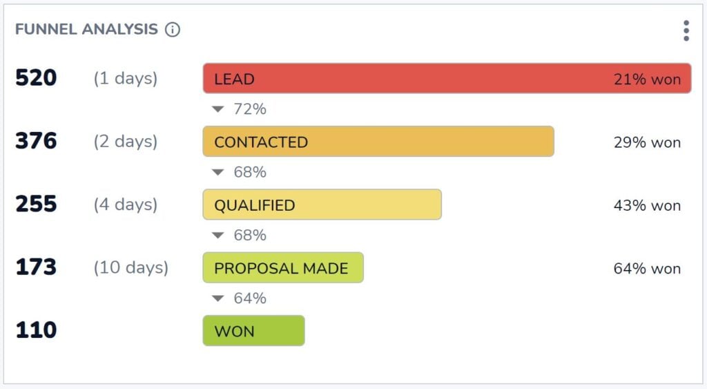
Quante opportunità raggiungono la fase vinta? E di quante opportunità avete bisogno in ogni fase precedente per ottenere quel risultato?
Questo è ciò a cui vi aiuta a rispondere l'indispensabile analisi dell'imbuto di Salesflare. Le risposte a queste domande essenziali sono disponibili nella dashboard "Revenue" della Salesflare.
Rapporto di chiusura per membro del team (incorporato)

Se volete sapere chi è il closer più efficiente, questo è il rapporto che state cercando.
Si trova nella dashboard "Team" in Salesflare.
# Opportunità vinte e perse al mese (personalizzate)

Ora, come cambia il vostro rapporto di chiusura nel tempo? E in che misura dipende dalla quantità totale di opportunità vinte o perse? Forse in alcuni mesi avete più contatti, ma non necessariamente più qualificati?
Questo è ciò che si può vedere riportando le opportunità vinte e quelle perse al mese.
Per costruirlo nell'Salesflare, fare un report sulle "opportunità", applicare il filtro del cruscotto alla "data di chiusura", scegliere un "grafico a barre" per rappresentarlo, misurare le "opportunità #" (asse delle ascisse), visualizzare la "data di chiusura dell'opportunità" (asse delle ordinate), segmentare per "fase dell'opportunità" e filtrare per mostrare solo le fasi che sono "vinte O perse" (barra laterale destra).

I principali motivi persi (incorporati)

Ora, analizziamo il "perché". Perché si perdono le opportunità? In questo modo sapremo come migliorare.
Questo report è integrato nel cruscotto "Entrate" di Salesflare. Ogni volta che si contrassegna un'opportunità come persa, Salesflare chiede il motivo.
Questo a meno che non si disabiliti il campo "Motivo dello smarrimento" in Impostazioni > Personalizza campi > Opportunità > Campi predefiniti, ma vi consigliamo di tenerlo abilitato! Questo report può essere una miniera d'oro per gli approfondimenti.
Principali motivi di perdita per proprietario dell'opportunità (personalizzato)

La verità è che persone diverse possono registrare motivi diversi a causa dei loro pregiudizi. Ecco perché ha senso riportare i motivi della perdita per ogni membro del team.
Per creare questo report nell'Salesflare, fare un report sulle "opportunità", applicare il filtro del cruscotto alla "data di chiusura", scegliere un "grafico a barre" per rappresentarlo, misurare le "opportunità #" (asse delle ascisse), visualizzare il "motivo della perdita dell'opportunità" (asse delle ordinate) e segmentare per il "proprietario dell'opportunità".

5. Cruscotto del ciclo di vendita
Abbiamo analizzato a lungo le nostre prestazioni, ma che dire della nostra velocità? 🏎️

Quanto velocemente stiamo lavorando su queste opportunità attraverso la pipeline? Chi riesce a chiudere gli affari più velocemente? E dove si bloccano di solito?
Durata media del ciclo di vendita (incorporata)

Qual è la lunghezza del vostro ciclo di vendita, ovvero quanto tempo passa in media dalla creazione di un'opportunità alla sua chiusura?
Questo report nel cruscotto "Entrate" di Salesflare risponde esattamente a questa domanda.
Durata media del ciclo di vendita per proprietario dell'opportunità nel tempo (personalizzata)

Questo report fa luce sulla rapidità con cui i diversi membri del team riescono a chiudere le trattative e su come questa varia nel tempo.
Per creare questo report in Salesflare, eseguire un report sulle "opportunità", applicare il filtro del cruscotto alla "data di chiusura", scegliere un "grafico a barre" per rappresentarlo, misurare in base al "ciclo di vendita medio" delle opportunità (asse x), visualizzare in base alla "data di chiusura dell'opportunità" (asse y) e segmentare in base al "proprietario dell'opportunità".
Successivamente, deselezionare "Impilare i segmenti" nelle opzioni avanzate (scorrere fino in fondo), poiché non ha senso impilare le medie.

Analisi dell'imbuto
Non avevamo già visto questo rapporto? Sì, l'abbiamo visto!
Questa volta non guardiamo alle prestazioni di chiusura, ma suddividiamo la durata del ciclo di vendita in base alle fasi.
È possibile consultare questo rapporto di "analisi dell'imbuto" nella dashboard "Entrate" in Salesflare ogni volta che si vuole sapere come ogni fase contribuisce alla lunghezza totale del ciclo di vendita.
6. Cruscotto delle attività di vendita
Finora abbiamo misurato l'output e le prestazioni. Ora misuriamo gli input, ovvero l'attività di vendita! ✉️📞📆

Compagno di squadra più attivo (incorporato)

Domanda semplice: chi è il tuo compagno di squadra più attivo?
Questa scorecard standard è integrata nel cruscotto "Team" dell'Salesflare.
Attività per compagno di squadra: riunioni, chiamate, e-mail (integrate)

Volete sapere come si articola questa attività?
Suddividete l'attività per persona in base alle e-mail inviate, alle chiamate effettuate e agli incontri con i clienti.
L'Salesflare tiene traccia di tutto ciò automaticamente e sa quali attività sono collegate a conti/clienti e quali no.
# Opportunità a caldo (personalizzata)

Per sapere quante opportunità hanno attraversato un certo livello di interesse e di attività, questo rapporto può aiutare.
In Salesflare, le opportunità vengono contrassegnate automaticamente come "calde" o "in fiamme" in base alle aperture delle e-mail, ai clic sui link, alle visite al sito web e all'attività e-mail.
Per creare un report in Salesflare per contare il numero di lead "caldi" in ogni momento, fare un report sulle "opportunità", applicare il filtro dashboard alla "data di chiusura", scegliere una "scorecard" per rappresentarla, misurare in base alle "opportunità #" e filtrare in base alla "hotness dell'account" per contare solo le opportunità collegate agli account "caldi o in fiamme".
Se non si desidera contare solo le opportunità con una "data di chiusura" nel periodo selezionato, scorrere le opzioni avanzate e selezionare "Non applicare il filtro temporale del cruscotto".

7. Cruscotto dei ricavi da abbonamenti
Se vendete abbonamenti, un modo per fare un resoconto delle entrate derivanti dagli abbonamenti è indispensabile.

Non aspettatevi nulla di troppo complesso dal monitoraggio dei ricavi da abbonamento in un CRM. Esistono soluzioni specializzate per questo, come ProfitWell, ChartMogul e Baremetrics.
Tuttavia, è importante disporre di una reportistica di base sui ricavi da abbonamento nel vostro CRM.
Vediamo cosa è possibile fare. 👇
Ricavi ricorrenti mensili (MRR) (integrato, opzionale)

Se vendete un prodotto SaaS o un altro tipo di prodotto o servizio in abbonamento, la crescita dei vostri ricavi ricorrenti mensili (MRR) potrebbe essere l'elemento principale da tenere sotto controllo.
Salesflare dispone di un report MRR integrato nel cruscotto "Entrate". Per visualizzare il report, attivare "entrate ricorrenti" nella pipeline, come mostrato di seguito.

MRR per account (personalizzato)

Infine, ma non meno importante, può essere interessante capire quali sono i vostri account principali in termini di ricavi ricorrenti mensili e come contribuiscono ciascuno di essi.
Per creare questo report in Salesflare, eseguire un report sulle "opportunità", applicare il filtro del cruscotto alla "data di chiusura", scegliere un "grafico a barre" per rappresentarlo, misurare in base alla "somma" delle "entrate ricorrenti dell'opportunità" (asse delle ascisse), visualizzare in base al "nome dell'account" (asse delle ordinate) e filtrare in base alla "fase" per includere solo le opportunità "vinte" (barra laterale destra).
Magia ✨

Fornitori di cruscotti di vendita
Volete iniziare a creare alcuni di questi elementi e non sapete quale software utilizzare? Ecco alcuni dei principali fornitori di dashboard di vendita.
Salesflare
Salesflare non solo rende super facile la creazione di cruscotti di vendita. Rende anche molto semplice tracciare i dati su cui si basano i cruscotti.
Il software si basa sulle informazioni già presenti nelle caselle di posta elettronica, nei calendari, ecc. del team di vendita e fa in modo che i dati siano facilmente rintracciabili. In questo modo non è possibile seguite i vostri contatti Ma è anche possibile creare dashboard, capire come si sta procedendo e migliorare di conseguenza.
Le dashboard standard che coprono le esigenze più comuni sono disponibili nel piano Growth ($29-35/utente/mese), mentre dashboard e report personalizzati sono disponibili nel piano Pro ($49-55/utente/mese).
HubSpot
Un altro sistema CRM con forte capacità di dashboarding delle vendite è HubSpot. HubSpot offre una suite completa di strumenti che consentono ai team di vendita di creare dashboard dettagliati. Questi cruscotti possono tracciare una serie di metriche, tra cui le prestazioni di vendita, la gestione delle pipeline e le interazioni con i clienti. I cruscotti di HubSpot sono altamente personalizzabili e consentono agli utenti di adattarli alle loro esigenze specifiche.
L'analisi delle vendite e le previsioni sono disponibili sul piano Sales Hub Professional ($90-100/utente/mese), mentre funzioni come il monitoraggio dei ricavi ricorrenti sono disponibili solo sul piano Sales Hub Enterprise (a partire da $150/utente/mese).
Geckoboard
Geckoboard è uno strumento dedicato ai dashboard che si integra con varie fonti di dati per fornire approfondimenti in tempo reale. È progettato per essere facile da usare, con un'interfaccia drag-and-drop che rende semplice la creazione di dashboard. Geckoboard supporta integrazioni con un'ampia gamma di sistemi CRM, strumenti di marketing e altre fonti di dati, consentendo ai team di vendita di monitorare i KPI in tempo reale.
I prezzi partono da $39-49/mese per il piano Essential, che include le funzioni e le integrazioni principali, mentre per le integrazioni CRM e le frequenze di aggiornamento dati più elevate è necessario passare al piano Pro ($79-99/mese) o al piano Scale ($559-699/mese).
Microsoft Power BI
Microsoft Power BI è un potente strumento di analisi aziendale che fornisce visualizzazioni interattive e funzionalità di business intelligence. Consente agli utenti di creare dashboard che combinano dati provenienti da varie fonti, tra cui sistemi CRM, database e fogli di calcolo. Power BI è noto per le sue solide capacità di analisi e visualizzazione dei dati, che lo rendono una scelta popolare per i team di vendita che devono analizzare set di dati complessi.
I prezzi di Power BI partono dal piano Pro a $10/utente/mese, che include funzionalità di BI self-service complete, fino al piano Premium (a partire da $20/utente/mese) per analisi avanzate e implementazioni su larga scala.
FAQ
Cosa comprende un cruscotto di vendita?
Un cruscotto di vendita comprende una raccolta di rapporti e indicatori di prestazione chiave (KPI) che visualizzano le attività e le prestazioni di vendita. In genere è organizzato in temi specifici, come il cruscotto Lead Generation (che tiene traccia delle nuove opportunità), il cruscotto Sales Revenue (che tiene conto degli accordi e dei ricavi ottenuti) e il cruscotto Sales Forecast (che prevede le entrate future).
Come si crea un cruscotto di vendita?
Per creare un dashboard delle vendite, in genere si utilizza un CRM o uno strumento dedicato al dashboard. Il processo prevede la creazione di singoli report selezionando i dati che si desidera misurare (ad esempio, le opportunità), scegliendo un tipo di grafico (come un grafico a barre o una scorecard), definendo cosa mostrare su ciascun asse (ad esempio, il valore per data) e applicando filtri (ad esempio, per un periodo di tempo specifico o una fase di vendita). Questi report vengono poi organizzati in un'unica vista del dashboard.
Quali sono i 4 tipi di dashboard?
Nell'ambito della business intelligence, i cruscotti sono generalmente classificati in quattro tipi principali:
- Cruscotti strategici: Fornire ai dirigenti una panoramica di alto livello degli obiettivi e delle prestazioni aziendali a lungo termine.
- Cruscotti analitici: Utilizzato dagli analisti di dati per esplorare i dati, identificare le tendenze e scoprire le intuizioni.
- Cruscotti operativi: Monitorare le attività operative in tempo reale per tenere traccia delle prestazioni e identificare i problemi immediati. Un cruscotto delle attività di vendita è un ottimo esempio.
- Cruscotti tattici: Utilizzato dai manager di medio livello per monitorare le prestazioni rispetto a obiettivi e tattiche specifiche del reparto.
Come creare un cruscotto di report sulle vendite in Excel?
Per creare un dashboard delle vendite in Excel, occorre innanzitutto organizzare tutti i dati sulle vendite in una tabella strutturata. Da qui, si possono usare le tabelle pivot per riassumere i dati e creare vari grafici (come grafici a barre, grafici a linee e grafici a torta) da questi riepiloghi. Infine, si organizzano tutti questi grafici in un unico foglio di calcolo che fungerà da dashboard. Questo processo è manuale e richiede un costante aggiornamento dei dati di partenza.
Qual è il miglior CRM per i cruscotti di vendita?
Il miglior CRM per i cruscotti di vendita è quello che non solo facilita la creazione di report, ma automatizza anche la raccolta dei dati che li alimentano. Un CRM come Salesflare eccelle in questo senso perché registra automaticamente le attività del team dalle loro e-mail, dal calendario e dal telefono. Questo garantisce che i dati nei dashboard siano sempre accurati e aggiornati senza richiedere uno sforzo manuale, fornendo così informazioni di cui ci si può fidare.
È stato un lungo elenco di esempi di dashboard di vendita (e di fornitori)! 😅 Le possibilità sono davvero infinite...
Se siete arrivati fino a qui, congratulazioni 🙌 Speriamo che abbiate trovato qualche buona ispirazione per creare altri report e ottenere approfondimenti.
Desidera costruire o sapere qualcos'altro? Chiedete al nostro team utilizzando la chat su salesflare.com. Siamo qui per aiutarvi 😄

Speriamo che questo post vi sia piaciuto. Se vi è piaciuto, spargete la voce!
👉 Potete seguire @salesflare su Twitter, Facebook e LinkedIn.
Ultimo aggiornamento:
- 8 Migliori CRM semplici nel 2026 - 29 Aprile 2026
- 7 Top CRM Tools in 2026 - 29 Aprile 2026
- I migliori 8 CRM AI testati - 29 Aprile 2026