7 Ejemplos de Cuadros de Mando de Ventas (30 Informes) + Cómo Construirlos
Vamos a conseguir que algunos conocimientos de ventas 💡
Quieres empezar a crear cuadros de mando de ventas pero no sabes por dónde empezar? 🤔
Hemos desglosado un conjunto relativamente amplio de KPIs/ métricas de ventas en 7 cuadros de mando de ventas independientes. Cada panel incluye informes de ejemplo y más información sobre su importancia.
Para aquellos que estén utilizando Salesflare o quieran utilizarlo, detallaremos qué informes están integrados y cuáles se pueden construir a medida. 👷♂️
Estos son los 7 cuadros de mando de ventas que exploraremos:
- Generación de clientes potenciales
- Previsión de ventas
- Ingresos por ventas
- Resultados del cierre de ventas
- Ciclo de ventas
- Actividad comercial
- Ingresos recurrentes
Puedes hacer clic en cualquiera en concreto ahora mismo 👆 o empezar desde el principio más abajo 👇.
Bienvenido al maravilloso mundo de los informes de ventas 🔮
¿Cuál es el alcance de cada cuadro de mando de ventas?
Con nuestras "impresionantes" habilidades en PowerPoint, hemos intentado visualizarlo para ti. 👇

Resumiendo:
- La generación de clientes potenciales llena nuestro canal de ventas.
- Actividad comercial empuja a sus clientes potenciales a través de él.
- Al final de la cadena se cierran.
- Mida la duración de su ciclo de ventas para conocer su velocidad.
- Prevea sus ingresos a partir del pipeline para predecir sus ingresos.
- Y luego mida sus ingresos por ventas (que podrían ser ingresos recurrentes).
¿Tiene sentido? 😁 ¡Empecemos a buscar ideas! ⛏️
1. Cuadro de mandos de generación de clientes potenciales
Empecemos por el principio de tu pipeline de ventas. Ya sabes 😁, esta cosa:

Si quiere obtener ingresos de forma constante, tiene que seguir obteniéndolos de forma constante. Nuestro primer panel de control de ventas te ayudará a medir lo bien que lo estás haciendo en ese frente... y cómo lo estás haciendo realidad.
Por cierto, ya estamos aquí:

# Nuevas oportunidades (incorporado)

La forma más sencilla de saber cuántos clientes potenciales ha generado es contar el número de nuevas oportunidades que tiene en cartera.
Encontrará este informe en Salesflare en el cuadro de mandos integrado "Ingresos".
# Cuentas nuevas (personalizadas)

Si no está creando inmediatamente una oportunidad para cada nuevo cliente potencial (lo que le recomendamos que haga), una medida alternativa que puede utilizar es el número de cuentas nuevas creadas.
Este informe es muy sencillo de crear en Salesflare: basta con informar sobre la entidad "cuentas", aplicar el filtro de tiempo del cuadro de mando a la "fecha de creación" y utilizar un "cuadro de mando" como tipo de gráfico.

Valor total de las nuevas oportunidades por mes (personalizado)

Contabilizar el número de nuevos clientes potenciales que está creando es una forma estupenda de medir sus aportaciones y mantener la motivación. Si además quieres saber qué representan esos nuevos clientes potenciales en términos de valor total aportado (y cómo evoluciona con el tiempo), este informe te resultará muy útil.
Para construirlo en Salesflare, informe sobre "oportunidades" (1), aplique el filtro del cuadro de mando a la "fecha de creación" (2), elija un "gráfico de columnas" para representarlo (3), visualice por la "fecha de creación de la oportunidad" (eje x) (4), y mida por la "suma" (5) del "valor de la oportunidad" (eje y) (6).

Principales fuentes de clientes potenciales (integrado, opcional)

Ahora que sabes cuántos leads traes y qué cantidad de valor total representan, la pregunta sigue siendo: ¿qué tácticas de generación de leads te están trayendo más leads? 💰
Por eso debes hacer un seguimiento de la "fuente de contactos" de cada nueva oportunidad. Así sabrás qué es lo que te genera más clientes potenciales y podrás redoblar tus esfuerzos en lo que funciona o explorar nuevas formas de generar clientes potenciales.
Como la mayoría de la gente no hace un seguimiento de las fuentes de los leads y nos gusta mantener las cosas limpias en Salesflare, lo hemos convertido en una opción que está desactivada por defecto, pero totalmente integrada para que puedas activar el campo en Configuración > Personalizar campos > Oportunidad > Campos predefinidos cuando estés listo (más información sobre esto aquí).
El informe anterior aparecerá automáticamente en el panel de control "Ingresos".
Valor total de las nuevas oportunidades por fuente de clientes potenciales (personalizado)

Este informe es una combinación de los dos anteriores: mide el valor total de las nuevas oportunidades, pero esta vez por fuente de contactos (y segmentado por países).
Puede construirlo en Salesflare de la siguiente manera: informe sobre "oportunidades", aplique el filtro del cuadro de mandos a la "fecha de creación", elija un "gráfico de columnas" para representarlo, visualice por la "fuente de oportunidades" (eje x) y mida por la "suma" del "valor de la oportunidad" (eje y).
Además, lo hemos segmentado por "país de la cuenta" para que podamos comprobar cómo está representado cada país (puedes pasar el ratón por encima de las barras en Salesflare para obtener más información sobre estos segmentos y su tamaño).

2. Cuadro de mando de previsión de ventas
Cuando sabemos cuántos leads se generan y cómo, podemos mirar un poco más allá en nuestro pipeline y empezar a hacer un seguimiento de cuántos ingresos se espera que produzca creando una previsión de ventas. 📈

Previsión de ingresos: Ingresos previstos (incorporados)

Este informe le ayuda a saber si alcanzará el objetivo... o no.
Suma los ingresos que ya ha conseguido y los que espera cerrar en el periodo actual. Este ingreso esperado se calcula multiplicando los valores de las oportunidades que espera cerrar este periodo por las probabilidades de que las gane.
Mientras que las previsiones de ingresos se incluyen como función en el plan Pro/Professional de la mayoría de software CRM para PYMES, se ofrece como un informe integrado (en el panel de control "Ingresos") en Salesflare el plan Crecimiento de menor precio, por lo que todo el mundo puede aprovecharlo fácilmente.
Ingresos esperados de las oportunidades abiertas por mes (a medida)

¿Quiere saber cuándo se espera que cierre todos esos ingresos? Sólo tienes que ver los ingresos previstos según su fecha de cierre prevista. ⏱️
Para construirlo en Salesflare, informe sobre "oportunidades", aplique el filtro del cuadro de mando a la "fecha de cierre", elija un "gráfico de columnas" para representarlo, visualice por la "fecha de cierre de la oportunidad" (eje x), y mida por la "suma" del "valor esperado de la oportunidad" (eje y).
Para incluir sólo los ingresos esperados de las oportunidades abiertas, filtre también las oportunidades por etapa. Excluye las oportunidades ganadas, perdidas y cualquier otra etapa que hayas creado tras ellas.

Ingresos previstos por etapa (a medida)

Si te preguntas en qué parte de tu pipeline se esconde el potencial de ingresos, este informe es lo que estás buscando. 👀
Para construirlo en Salesflare, puede duplicar el informe anterior y hacer un retoque: medir por la "etapa de oportunidad".
Para construirlo desde cero: informe sobre "oportunidades", aplique el filtro del cuadro de mandos a la "fecha de cierre", elija un "gráfico de columnas" para representarlo, visualice por la "etapa de la oportunidad" (eje x) y mida por la "suma" del "valor esperado de la oportunidad" (eje y). A continuación, filtre (a la derecha) para incluir sólo las primeras etapas.

Ingresos previstos por país (a medida)

Por último, si quieres saber en qué países se espera que obtengas esos ingresos, puedes elaborar este informe. 🌍
Puede duplicar fácilmente uno de los dos informes anteriores, convertirlo en un "gráfico circular" y segmentarlo por "país de la cuenta".
Para construirlo desde cero: informe sobre "oportunidades", aplique el filtro del cuadro de mandos a la "fecha de cierre", elija un "gráfico circular" para representarlo, mida por la "suma" del "valor esperado de la oportunidad" y segmente por "país de la cuenta". A continuación, filtre (a la derecha) para incluir sólo las primeras etapas.

3. Cuadro de mandos de ingresos por ventas
Hasta ahora, hemos estado midiendo los nuevos clientes potenciales y previendo los ingresos esperados. Ahora es el momento de medir los resultados.

Responderemos a preguntas como:
- ¿Cuántos acuerdos cerramos?
- ¿Quién las cierra?
- ¿Cuál es el valor medio por operación?
- ¿Quiénes son nuestros principales clientes?
- ¿Y cuáles son nuestros productos estrella?
Vamos a empezar 👇
# Oportunidades ganadas (incorporado)

Quieres contar la cantidad de oportunidades que has ganado? 🔢
Este informe está integrado en el cuadro de mandos "Ingresos" de Salesflare.
# Oportunidades ganadas por propietario de la oportunidad al mes (personalizado)

Para ver cómo contribuye cada persona al número de oportunidades ganadas a lo largo del tiempo, puede elaborar este informe.
Para hacerlo en Salesflare, informe sobre "oportunidades", aplique el filtro del cuadro de mando a la "fecha de cierre", elija un "gráfico de barras" para representarlo, mida por las "oportunidades #" (eje x), visualice por la "fecha de cierre de la oportunidad" (eje y), segmente por "propietario de la oportunidad" y filtre por la etapa "ganada" (barra lateral derecha).

Si desea ver los segmentos de la barra uno junto a otro en lugar de apilados, desplácese hasta las "Opciones avanzadas" y desactive la opción "Apilar segmentos".
Valor medio de las oportunidades ganadas (incorporadas)

Lo que puede ser interesante ver es el tamaño medio de sus acuerdos... y su evolución. 📊
Salesflare muestra este informe por defecto en el panel de control "Ingresos".
Valor medio de las oportunidades ganadas por propietario de la oportunidad (personalizado)

Conoces el tamaño medio de tus operaciones, pero no sabes cómo difiere entre los miembros del equipo. ¡Vamos a averiguarlo! 🤓
Para construir el informe en Salesflare, informe sobre "oportunidades", aplique el filtro del cuadro de mando a la "fecha de cierre", elija un "gráfico de barras" para representarlo, mida por el "valor de la oportunidad" (eje x), visualice por el "propietario de la oportunidad" (eje y), y filtre sobre la etapa "ganada" (barra lateral derecha). ¡Listo!

Cuentas que más ganan: tabla (integrada)

Si quiere saber quiénes son sus mejores clientes en términos de ingresos obtenidos en el periodo actual, necesita un informe de "cuentas que más ganan".
Salesflare lo muestra por defecto en el cuadro de mandos "Ingresos".
Cuentas que más ganan: gráfico de barras (personalizado)

¿Te gusta lo anterior pero quieres ver un gráfico en lugar de una tabla? ¡Te escuchamos! 🙌
Para construir este informe en Salesflare, informe sobre "oportunidades", aplique el filtro del cuadro de mandos a la "fecha de cierre", elija un "gráfico de barras" para representarlo, mida por la "suma" del "valor de la oportunidad" (eje x), visualice por el "nombre de la cuenta" (eje y) y filtre por la etapa "ganada" (barra lateral derecha).
Entonces obtienes esto 👇

Clasificación (integrada)

Si desea ver el rendimiento de cada uno en comparación con su cuota de ingresos, necesita una tabla de clasificación. Los miembros del equipo con las ventas totales más altas en comparación con la cuota suelen aparecer en la parte superior.
Salesflare lo ofrece en el panel "Equipo". No es necesario que lo construyas tú mismo.
Ingresos por producto (a medida)

Si vendes diferentes productos, también puede ser útil separar tus ingresos por producto.
Para empezar a hacer esto, por supuesto, primero tendrá que realizar un seguimiento de sus ingresos por producto. En Salesflare, puede crear un campo personalizado llamado "producto" de tipo "desplegable".
A continuación, para construir el informe en Salesflare, informe sobre "oportunidades", aplique el filtro del cuadro de mandos a la "fecha de cierre", elija un "gráfico de barras" para representarlo, mida por la "suma" del "valor de la oportunidad" (eje x), visualice por su campo personalizado "producto" (eje y) y filtre por la etapa "ganada" (barra lateral derecha).
Y, boom, ahí lo tienes... ¡ya puedes ver cuál es tu producto estrella!

4. Cuadro de mando del rendimiento del cierre de ventas
Centrémonos ahora en su rendimiento de cierre.

¿Cuántos de los clientes potenciales recién generados se ganan? ¿Quién cierra mejor? Y por qué se pierden? 🤔
Éstas son algunas de las preguntas importantes que intentaremos responder.
Análisis del embudo
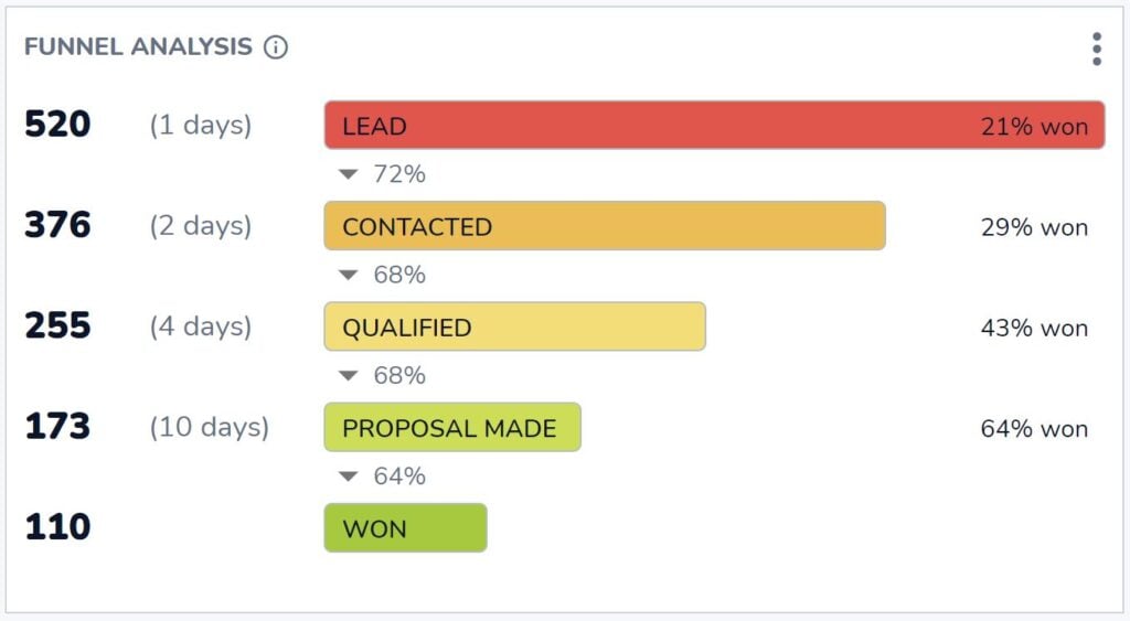
¿Cuántas oportunidades llegan a la etapa ganada? ¿Y cuántas oportunidades necesita en cada etapa anterior para obtener ese resultado?
Esto es lo que el indispensable análisis del embudo de Salesflare le ayuda a responder. Encontrará las respuestas a estas preguntas esenciales en el panel de control "Ingresos" de Salesflare.
Ratio de cierre por miembro del equipo (incorporado)

Si quiere saber quién es el cerrador más eficaz, éste es el informe que busca.
Puedes encontrarlo en el panel "Equipo" en Salesflare.
# Oportunidades ganadas vs perdidas por mes (personalizado)

Ahora bien, ¿cómo cambia su ratio de cierre con el tiempo? ¿Y hasta qué punto depende de la cantidad total de oportunidades que se ganan o se pierden? ¿Puede que algunos meses tenga más clientes potenciales, pero no necesariamente más cualificados?
Eso es lo que se puede ver informando sobre las oportunidades ganadas frente a las perdidas al mes.
Para construir esto en Salesflare, informe sobre "oportunidades", aplique el filtro del cuadro de mando a la "fecha de cierre", elija un "gráfico de barras" para representarlo, mida por las "oportunidades #" (eje x), visualice por la "fecha de cierre de la oportunidad" (eje y), segmente por "etapa de la oportunidad" y filtre para mostrar sólo las etapas "ganadas O perdidas" (barra lateral derecha).

Razones principales de la pérdida (incorporadas)

Ahora, profundicemos en el "por qué". ¿Por qué se pierden oportunidades? Así sabremos cómo mejorar.
Este informe está integrado en el panel "Ingresos" de Salesflare. Cada vez que marque una oportunidad como perdida, Salesflare le preguntará el motivo.
A menos que desactive el campo "Motivo de la pérdida" en Configuración > Personalizar campos > Oportunidades > Campos predefinidos, aunque le recomendamos que lo mantenga activado. Este informe puede ser una mina de oro.
Principales motivos de pérdida por propietario de la oportunidad (personalizado)

La verdad es que cada persona puede registrar razones diferentes debido a sus prejuicios. Por eso también tiene sentido informar de las razones perdidas por miembro del equipo.
Para construir este informe en Salesflare, informe sobre "oportunidades", aplique el filtro del cuadro de mando a la "fecha de cierre", elija un "gráfico de barras" para representarlo, mida por las "oportunidades #" (eje x), visualice por el "motivo de pérdida de la oportunidad" (eje y), y segmente por el "propietario de la oportunidad".

5. Cuadro de mando del ciclo de ventas
Ya hemos analizado ampliamente nuestro rendimiento, pero ¿qué hay de nuestra velocidad? 🏎️

¿A qué velocidad estamos trabajando estas oportunidades? ¿Quién puede cerrar acuerdos más rápido? ¿Y dónde suelen atascarse?
Duración media del ciclo de ventas (incorporado)

¿Cuál es la duración de su ciclo de ventas, es decir, cuánto tarda de media desde que se crea una oportunidad hasta que se cierra como ganada?
Este informe del panel "Ingresos" de Salesflare responde exactamente a esa pregunta.
Duración media del ciclo de ventas por propietario de la oportunidad a lo largo del tiempo (personalizado)

Este informe arroja luz sobre la rapidez de los distintos miembros del equipo a la hora de cerrar acuerdos y cómo cambia con el tiempo.
Para construir este informe en Salesflare, informe sobre "oportunidades", aplique el filtro del cuadro de mandos a la "fecha de cierre", elija un "gráfico de barras" para representarlo, mida por el "ciclo medio de venta de oportunidades" (eje x), visualice por la "fecha de cierre de la oportunidad" (eje y), y segmente por el "propietario de la oportunidad".
A continuación, desactive la opción "Apilar segmentos" en las opciones avanzadas (desplácese hasta la parte inferior), ya que no tiene mucho sentido apilar medias.

Análisis del embudo
No habíamos visto ya este informe antes? ¡Sí, lo vimos!
Esta vez no nos fijaremos en el rendimiento de cierre, sino que desglosaremos la duración de nuestro ciclo de ventas por etapas.
Puede consultar este informe de "análisis del embudo" en el panel "Ingresos" de Salesflare siempre que desee saber cómo contribuye cada etapa a la duración total del ciclo de ventas.
6. Panel de actividad de ventas
Hasta ahora, hemos medido la producción y el rendimiento. Ahora vamos a medir el input, es decir, la actividad comercial. ✉️📞📆

Compañero de equipo más activo (incorporado)

Una pregunta sencilla: ¿quién es tu compañero más activo?
Este cuadro de mando estándar está integrado en el cuadro de mandos "Equipo" de Salesflare.
Actividad por compañero de equipo: reuniones, llamadas, correos electrónicos (integrado)

¿Quiere saber cómo se desglosa esa actividad?
Divida la actividad por persona en correos electrónicos enviados, llamadas realizadas y reuniones mantenidas con los clientes.
Salesflare realiza un seguimiento automático de todo lo anterior y sabe qué actividad está vinculada a cuentas/clientes y cuál no.
# Oportunidades en caliente (personalizado)

Para saber cuántas oportunidades se cruzaron con un determinado interés y nivel de actividad, este informe puede ayudar.
En Salesflare, las oportunidades se marcan automáticamente como "calientes" o "en llamas" en función de las aperturas de correos electrónicos, los clics en enlaces, las visitas al sitio web y la actividad del correo electrónico.
Para crear un informe en Salesflare para contar el número de clientes potenciales calientes en todo momento, informe sobre "oportunidades", aplique el filtro del cuadro de mando a la "fecha de cierre", elija un "cuadro de mando" para representarlo, mida por las "oportunidades #" y filtre por el "hotness de la cuenta" para contar sólo las oportunidades vinculadas a cuentas "calientes O en llamas".
Si no desea contar sólo las oportunidades con una "fecha de cierre" en el periodo seleccionado, desplácese hasta las opciones avanzadas y marque "No aplicar el filtro de tiempo del cuadro de mando".

7. Cuadro de mandos de ingresos por suscripción
Si vende suscripciones, es imprescindible disponer de una forma de informar sobre sus ingresos por suscripciones.

No espere nada demasiado complejo del seguimiento de los ingresos por suscripción en un CRM. Existen soluciones especializadas para ello como ProfitWell, ChartMogul y Baremetrics.
Aun así, es estupendo disponer de algunos informes básicos sobre ingresos por suscripciones en su CRM.
Veamos lo que es posible. 👇
Ingresos recurrentes mensuales (MRR) (integrado, opcional)

Si vende un producto SaaS u otro tipo de producto o servicio de suscripción, el crecimiento de sus ingresos mensuales recurrentes (MRR) puede ser lo principal que esté siguiendo.
Salesflare tiene un informe MRR integrado en el panel de control "Ingresos". Para que aparezca el informe, active "ingresos recurrentes" en el pipeline como se muestra a continuación.

MRR por cuenta (personalizado)

Por último, pero no por ello menos importante, puede ser interesante averiguar cuáles son sus principales cuentas en términos de ingresos recurrentes mensuales y cuál es la contribución de cada una de ellas.
Para construir este informe en Salesflare, informe sobre "oportunidades", aplique el filtro del cuadro de mandos a la "fecha de cierre", elija un "gráfico de barras" para representarlo, mida por la "suma" de los "ingresos recurrentes de la oportunidad" (eje x), visualice por el "nombre de la cuenta" (eje y), y filtre por la "etapa" para incluir sólo las oportunidades "ganadas" (barra lateral derecha).
Magia ✨

Proveedores de cuadros de mando de ventas
¿Quiere empezar a crear alguno de los anteriores y no está seguro de qué software utilizar? Estos son algunos de los principales proveedores de cuadros de mando de ventas.
Salesflare
Salesflare no sólo facilita enormemente la creación de cuadros de mando de ventas. También facilita enormemente el seguimiento de los datos en los que se basarán esos cuadros de mando.
El software se basa en la información que ya existe en las bandejas de entrada, calendarios, etc. del equipo de ventas y se asegura de que los datos sean fácilmente rastreables. De esta forma no haga un seguimiento de sus clientes potenciales y obtener más ingresos, pero también puede crear cuadros de mando, saber cómo lo está haciendo y mejorar en consecuencia.
Los cuadros de mando estándar que cubren las necesidades más comunes están disponibles en el plan Crecimiento ($29-35/usuario/mes) y los cuadros de mando e informes personalizados se encuentran en el plan Pro ($49-55/usuario/mes).
HubSpot
Otro sistema CRM con fuertes capacidades de cuadros de mando de ventas es HubSpot. HubSpot ofrece un conjunto completo de herramientas que permiten a los equipos de ventas crear cuadros de mando detallados. Estos cuadros de mando pueden realizar un seguimiento de una variedad de métricas, incluyendo el rendimiento de ventas, la gestión del pipeline y las interacciones con los clientes. Los cuadros de mando de HubSpot son altamente personalizables, lo que permite a los usuarios adaptarlos a sus necesidades específicas.
El análisis y la previsión de ventas están disponibles en el plan Sales Hub Professional ($90-100/usuario/mes), mientras que funciones como el seguimiento de los ingresos recurrentes sólo se encuentran en el plan Sales Hub Enterprise (a partir de $150/usuario/mes).
Geckoboard
Geckoboard es una herramienta específica para cuadros de mando que se integra con diversas fuentes de datos para proporcionar información en tiempo real. Está diseñada para ser fácil de usar, con una interfaz de arrastrar y soltar que facilita la creación de cuadros de mando. Geckoboard admite integraciones con una amplia gama de sistemas CRM, herramientas de marketing y otras fuentes de datos, lo que permite a los equipos de ventas supervisar los KPI en tiempo real.
Los precios comienzan en $39-49/mes para el plan Esencial, que incluye las funciones básicas e integraciones, mientras que para las integraciones CRM y mayores tasas de actualización de datos es necesario pasar al plan Pro ($79-99/mes) o al plan Escala ($559-699/mes).
Microsoft Power BI
Microsoft Power BI es una potente herramienta de análisis empresarial que proporciona visualizaciones interactivas y funciones de inteligencia empresarial. Permite a los usuarios crear cuadros de mando que combinan datos de diversas fuentes, como sistemas CRM, bases de datos y hojas de cálculo. Power BI es conocido por sus sólidas capacidades de análisis y visualización de datos, lo que lo convierte en una opción popular para los equipos de ventas que necesitan analizar conjuntos de datos complejos.
Los precios de Power BI comienzan con el plan Pro a $10/usuario/mes, que incluye todas las funciones de BI de autoservicio, y aumentan hasta el plan Premium (a partir de $20/usuario/mes) para análisis avanzados e implantaciones a mayor escala.
PREGUNTAS FRECUENTES
¿Qué incluye un cuadro de mando de ventas?
Un panel de control de ventas incluye una colección de informes e indicadores clave de rendimiento (KPI) que visualizan tus actividades y rendimiento de ventas. Suele organizarse en temas específicos, como un cuadro de mando de generación de clientes potenciales (seguimiento de nuevas oportunidades), un cuadro de mando de ingresos por ventas (seguimiento de acuerdos e ingresos conseguidos) y un cuadro de mando de previsión de ventas (predicción de ingresos futuros).
¿Cómo se crea un panel de ventas?
Para crear un cuadro de mando de ventas, se suele utilizar un CRM o una herramienta específica para cuadros de mando. El proceso consiste en crear informes individuales seleccionando los datos que se quieren medir (por ejemplo, las oportunidades), eligiendo un tipo de gráfico (como un gráfico de barras o un cuadro de mando), definiendo qué mostrar en cada eje (por ejemplo, el valor por fecha) y aplicando filtros (por ejemplo, para un periodo de tiempo o una fase de ventas específicos). A continuación, estos informes se agrupan en una única vista de cuadro de mando.
¿Cuáles son los 4 tipos de cuadros de mando?
En inteligencia empresarial, los cuadros de mando se clasifican generalmente en cuatro tipos principales:
- Cuadros de mando estratégicos: Proporcionar a los ejecutivos una visión general de alto nivel de los objetivos y resultados de la empresa a largo plazo.
- Cuadros de mando analíticos: Utilizado por analistas de datos para explorar datos, identificar tendencias y descubrir perspectivas.
- Cuadros de mando operativos: Supervise las actividades operativas en tiempo real para hacer un seguimiento del rendimiento e identificar problemas inmediatos. Un buen ejemplo es un panel de actividad de ventas.
- Cuadros de mando tácticos: Utilizado por los mandos intermedios para hacer un seguimiento de los resultados en relación con los objetivos y tácticas específicos del departamento.
¿Cómo crear un cuadro de mando de informes de ventas en Excel?
Para crear un cuadro de mando de ventas en Excel, organice primero todos sus datos de ventas en una tabla estructurada. A partir de ahí, puede utilizar tablas dinámicas para resumir los datos y crear varios gráficos (como gráficos de barras, de líneas y circulares) a partir de estos resúmenes. Por último, organiza todos estos gráficos en una única hoja de cálculo para que actúe como cuadro de mando. Este proceso es manual y requiere actualizar constantemente los datos de origen.
¿Cuál es el mejor CRM para cuadros de mando de ventas?
El mejor CRM para cuadros de mando de ventas es aquel que no solo facilita la creación de informes, sino que también automatiza la recopilación de datos que los alimentan. Un CRM como Salesflare destaca en esto porque registra automáticamente las actividades de su equipo desde sus correos electrónicos, calendario y teléfono. Esto garantiza que los datos de sus cuadros de mando sean siempre precisos y estén actualizados sin necesidad de esfuerzo manual, ofreciéndole información en la que puede confiar.
Uf, ¡qué larga ha sido la lista de ejemplos de cuadros de mando de ventas (y proveedores)! Las posibilidades son realmente infinitas...
Si has llegado hasta aquí, enhorabuena 🙌 Esperamos que hayas encontrado una buena inspiración para construir más informes y obtener conocimientos más profundos.
¿Algo más que te gustaría construir o saber? Solo tienes que preguntar a nuestro equipo a través del chat en salesflare.com. Estamos aquí para ayudarte 😄.

Esperamos que te haya gustado este post. Si es así, ¡difúndelo!
👉 Puede seguir a @salesflare en Twitter, Facebook y LinkedIn.
Última actualización:
- Los 8 mejores CRM para startups en 2026 - 15 de junio de 2026
- 8 Mejores CRM Sencillos en 2026 - 29 de abril de 2026
- 7 Principales Herramientas CRM en 2026 - 29 de abril de 2026