7 exemples de tableaux de bord commerciaux (30 rapports) + comment les créer
Nous allons vous donner des informations sur les ventes 💡
Vous souhaitez commencer à construire des tableaux de bord de vente mais ne savez pas par où commencer ? 🤔
Nous avons décomposé un ensemble relativement complet d'indicateurs et de paramètres de vente en 7 tableaux de bord de vente distincts. Chaque tableau de bord est accompagné d'exemples de rapports et de précisions sur leur importance.
Pour ceux qui utilisent Salesflare ou qui cherchent à l'utiliser, nous détaillerons les rapports qui sont intégrés et ceux qui peuvent être conçus sur mesure. 👷♂️
Voici les 7 tableaux de bord de la vente que nous allons explorer :
- Génération de leads
- Prévisions de vente
- Chiffre d'affaires
- Performances en matière de clôture des ventes
- Cycle de vente
- Activité de vente
- Recettes récurrentes
Vous pouvez cliquer sur l'un d'entre eux 👆 ou commencer par le début 👇.
Bienvenue dans le monde merveilleux du rapport de vente 🔮
Quelle est la portée de chaque tableau de bord des ventes ?
Grâce à nos compétences "impressionnantes" en PowerPoint, nous avons essayé de visualiser cela pour vous. 👇

En bref :
- La génération de leads alimente notre pipeline de ventes.
- Activité de vente pousse vos prospects à l'utiliser.
- À la fin de la filière, vous les fermez.
- Mesurez la durée de votre cycle de vente pour connaître votre vitesse.
- Prévoyez vos revenus à partir du pipeline pour prévoir vos revenus.
- Mesurez ensuite votre chiffre d'affaires (qui peut être un chiffre d'affaires récurrent).
C'est logique ? 😁 Commençons à creuser pour trouver des idées ! ⛏️
1. Tableau de bord de génération de leads
Commençons par le début de votre pipeline de vente. Vous savez 😁, ce truc :

Si vous voulez générer des revenus de manière régulière, vous devez les remplir de manière régulière. Notre premier tableau de bord des ventes vous aidera à mesurer vos performances dans ce domaine... et à déterminer comment vous y parvenez.
D'ailleurs, nous sommes maintenant ici :

# Nouvelles opportunités (intégrées)

Le moyen le plus simple de savoir combien de pistes vous avez générées est de compter le nombre de nouvelles opportunités dans votre pipeline.
Vous trouverez ce rapport dans Salesflare sur le tableau de bord intégré "Revenu".
# Nouveaux comptes (personnalisés)

Si vous ne créez pas immédiatement une opportunité pour chaque nouveau prospect (ce que nous vous recommandons de faire), le nombre de nouveaux comptes créés est une autre mesure que vous pouvez utiliser.
Ce rapport est très simple à créer dans Salesflare : il suffit d'établir un rapport sur l'entité "comptes", d'appliquer le filtre temporel du tableau de bord à la "date de création" et d'utiliser un "tableau de bord" comme type de graphique.

Valeur totale des nouvelles opportunités par mois (sur mesure)

Compter le nombre de nouveaux prospects que vous créez est un excellent moyen de mesurer votre contribution et de rester motivé. Si vous souhaitez également savoir ce que ces nouveaux leads représentent en termes de valeur totale apportée (et comment celle-ci évolue dans le temps), ce rapport vous sera utile.
Pour le construire dans Salesflare, faites un rapport sur les "opportunités" (1), appliquez le filtre du tableau de bord à la "date de création" (2), choisissez un "diagramme à colonnes" pour le représenter (3), visualisez par la "date de création de l'opportunité" (axe x) (4), et mesurez par la "somme" (5) de la "valeur de l'opportunité" (axe y) (6).

Principales sources de prospects (intégrées, facultatives)

Maintenant que vous savez combien de leads vous apportez et quel montant de valeur totale ils représentent, la question demeure : quelles tactiques de génération de leads vous apportent le plus de leads ? 💰
C'est la raison pour laquelle vous devez suivre la "source de leads" de chaque nouvelle opportunité. Vous saurez ainsi ce qui génère le plus de prospects, ce qui vous permettra de continuer à travailler sur ce qui fonctionne ou d'explorer de nouveaux moyens de générer des prospects.
Comme la plupart des gens ne suivent pas les sources de leads et que nous aimons garder les choses propres dans Salesflare, nous en avons fait une option qui est désactivée par défaut mais entièrement intégrée de sorte que vous pouvez activer le champ dans Paramètres > Personnaliser les champs > Opportunité > Champs prédéfinis dès que vous êtes prêt (plus d'informations à ce sujet ici).
Le rapport ci-dessus s'affichera alors automatiquement dans votre tableau de bord intégré "Revenus".
Valeur totale des nouvelles opportunités par source de leads (sur mesure)

Ce rapport est une combinaison des deux précédents : il mesure la valeur totale des nouvelles opportunités, mais cette fois par source de leads (et segmentée par pays).
Vous pouvez le construire dans Salesflare comme suit : rapport sur les "opportunités", application du filtre du tableau de bord à la "date de création", choix d'un "diagramme à colonnes" pour le représenter, visualisation par la "source de l'opportunité" (axe x), et mesure par la "somme" de la "valeur de l'opportunité" (axe y).
Nous l'avons également segmenté par "pays du compte" afin de pouvoir vérifier comment chaque pays est représenté (vous pouvez passer la souris sur les barres dans Salesflare pour obtenir plus d'informations sur ces segments et leur taille).

2. Tableau de bord des prévisions de ventes
Lorsque nous savons combien de pistes sont générées et comment, nous pouvons regarder un peu plus loin dans notre pipeline et commencer à suivre le chiffre d'affaires qu'il devrait produire en créant un prévision des ventes. 📈

Prévisions de recettes : Recettes attendues (intégrées)

Ce rapport vous aide à déterminer si vous atteindrez la cible... ou non.
Il additionne le chiffre d'affaires que vous avez déjà gagné et le chiffre d'affaires que vous vous attendez à conclure au cours de la période actuelle. Ce revenu attendu est calculé en multipliant les valeurs des opportunités que vous prévoyez de conclure au cours de cette période par les probabilités que vous les remportiez.
Alors que les prévisions de revenus sont incluses dans le plan Pro/Professionnel de la plupart des small business CRM software, elles sont proposées sous forme de rapport intégré (dans le tableau de bord "Revenus") dans le plan Growth le moins cher de Salesflare, ce qui permet à tout le monde d'en profiter facilement.
Recettes attendues des opportunités ouvertes par mois (sur mesure)

Vous voulez savoir quand vous êtes censé clôturer toutes ces recettes ? Il vous suffit d'afficher les recettes attendues en fonction de leur date de clôture prévue. ⏱️
Pour le construire dans Salesflare, faites un rapport sur les "opportunités", appliquez le filtre du tableau de bord à la "date de clôture", choisissez un "diagramme à colonnes" pour le représenter, visualisez par la "date de clôture de l'opportunité" (axe x), et mesurez par la "somme" de la "valeur attendue de l'opportunité" (axe y).
Pour n'inclure que les revenus attendus des opportunités ouvertes, filtrez également les opportunités par étape. Excluez les étapes gagnées, perdues et toute autre étape que vous avez créée derrière celles-ci.

Recettes attendues par étape (sur mesure)

Si vous vous demandez où se cache le potentiel de revenus dans votre pipeline, ce rapport est ce que vous cherchez. 👀
Pour le créer dans Salesflare, vous pouvez reproduire le rapport ci-dessus et y apporter une modification : mesurer par "stade de l'opportunité".
Pour le construire à partir de zéro : rapport sur les "opportunités", application du filtre du tableau de bord à la "date de clôture", choix d'un "diagramme à colonnes" pour le représenter, visualisation par le "stade de l'opportunité" (axe x), et mesure par la "somme" de la "valeur attendue de l'opportunité" (axe y). Filtrez ensuite (à droite) pour n'inclure que les premières étapes.

Recettes attendues par pays (sur mesure)

Enfin, si vous souhaitez savoir dans quels pays vous êtes censé réaliser ce chiffre d'affaires, vous pouvez établir ce rapport. 🌍
Vous pouvez facilement reproduire l'un des deux rapports ci-dessus, le transformer en "camembert" et le segmenter par "pays du compte".
Pour le construire à partir de zéro : rapport sur les "opportunités", application du filtre du tableau de bord à la "date de clôture", choix d'un "camembert" pour le représenter, mesure par la "somme" de la "valeur attendue de l'opportunité" et segmentation par "pays du compte". Filtrez ensuite (à droite) pour n'inclure que les premières étapes.

3. Tableau de bord du chiffre d'affaires
Jusqu'à présent, nous avons mesuré les nouveaux prospects et prévu les recettes attendues. Il est maintenant temps de mesurer les résultats.

Nous répondrons à des questions telles que
- Combien de contrats concluons-nous ?
- Qui les ferme ?
- Quelle est la valeur moyenne d'une transaction ?
- Qui sont nos principaux clients ?
- Et quels sont nos meilleurs produits ?
Commençons 👇
# Opportunités gagnées (intégrées)

Vous voulez compter le nombre d'opportunités que vous avez gagnées ? 🔢
Ce rapport est intégré au tableau de bord "Revenu" de Salesflare.
# Opportunités gagnées par le propriétaire de l'opportunité par mois (personnalisé)

Pour voir comment chaque personne contribue au nombre d'opportunités gagnées au fil du temps, vous pouvez créer ce rapport.
Pour ce faire dans Salesflare, faites un rapport sur les "opportunités", appliquez le filtre du tableau de bord à la "date de clôture", choisissez un "diagramme à barres" pour le représenter, mesurez les "opportunités #" (axe x), visualisez la "date de clôture de l'opportunité" (axe y), segmentez par "propriétaire de l'opportunité", et filtrez sur l'étape "gagné" (barre latérale droite).

Si vous souhaitez voir les segments de barres les uns à côté des autres au lieu de les empiler, faites défiler vers le bas jusqu'aux "Options avancées" et décochez l'option "Empiler les segments".
Valeur moyenne des opportunités remportées (intégrée)

Il peut être intéressant de voir quelle est la taille moyenne de vos transactions... et comment cela évolue. 📊
Salesflare affiche ce rapport par défaut dans le tableau de bord "Revenus".
Valeur moyenne des opportunités remportées par le détenteur de l'opportunité (sur mesure)

Vous connaissez donc la taille moyenne de vos transactions, mais vous ne savez pas comment elle varie selon les membres de votre équipe. Essayons d'y remédier ! 🤓
Pour créer le rapport dans Salesflare, faites un rapport sur les "opportunités", appliquez le filtre du tableau de bord à la "date de clôture", choisissez un "diagramme à barres" pour le représenter, mesurez par la "valeur de l'opportunité" (axe x), visualisez par le "propriétaire de l'opportunité" (axe y), et filtrez sur l'étape "gagnée" (barre latérale droite). C'est fait !

Comptes les plus rémunérateurs : tableau (intégré)

Si vous voulez savoir qui sont vos meilleurs clients en termes de revenus gagnés pendant la période en cours, vous avez besoin d'un rapport sur les "comptes les plus rentables".
Salesflare l'affiche par défaut dans le tableau de bord "Revenus".
Comptes les plus rémunérateurs : diagramme à barres (personnalisé)

Vous aimez ce qui précède, mais vous voulez voir un graphique au lieu d'un tableau ? Nous sommes d'accord ! 🙌
Pour créer ce rapport dans Salesflare, faites un rapport sur les "opportunités", appliquez le filtre du tableau de bord à la "date de clôture", choisissez un "diagramme à barres" pour le représenter, mesurez par la "somme" de la "valeur de l'opportunité" (axe x), visualisez par le "nom du compte" (axe y), et filtrez sur l'étape "gagnée" (barre latérale droite).
Puis vous obtenez ceci 👇

Tableau des leaders (intégré)

Si vous souhaitez connaître les performances de chacun par rapport à son quota de chiffre d'affaires, vous avez besoin d'un tableau de bord. Les membres de l'équipe dont les ventes totales sont les plus élevées par rapport à leur quota figurent généralement en haut de la liste.
Salesflare propose cela dans le tableau de bord "Team". Il n'est pas nécessaire de le construire soi-même.
Recettes par produit (sur mesure)

Si vous vendez différents produits, il peut également être utile de ventiler vos revenus par produit.
Pour commencer, vous devez bien sûr suivre vos revenus par produit. Dans Salesflare, vous pouvez simplement créer un champ personnalisé nommé "produit" de type "dropdown".
Ensuite, pour créer le rapport dans Salesflare, faites un rapport sur les "opportunités", appliquez le filtre du tableau de bord à la "date de clôture", choisissez un "diagramme à barres" pour le représenter, mesurez par la "somme" de la "valeur de l'opportunité" (axe x), visualisez par votre champ personnalisé "produit" (axe y), et filtrez sur l'étape "gagnée" (barre latérale droite).
Et voilà, vous pouvez voir quel est votre produit phare !

4. Tableau de bord des performances de clôture des ventes
Zoomons maintenant sur vos performances de clôture.

Combien de prospects nouvellement générés sont gagnés ? Qui est le meilleur pour conclure ? Et pourquoi les perdent-ils ? 🤔
Voilà quelques-unes des questions importantes auxquelles nous tenterons de répondre.
Analyse de l'entonnoir
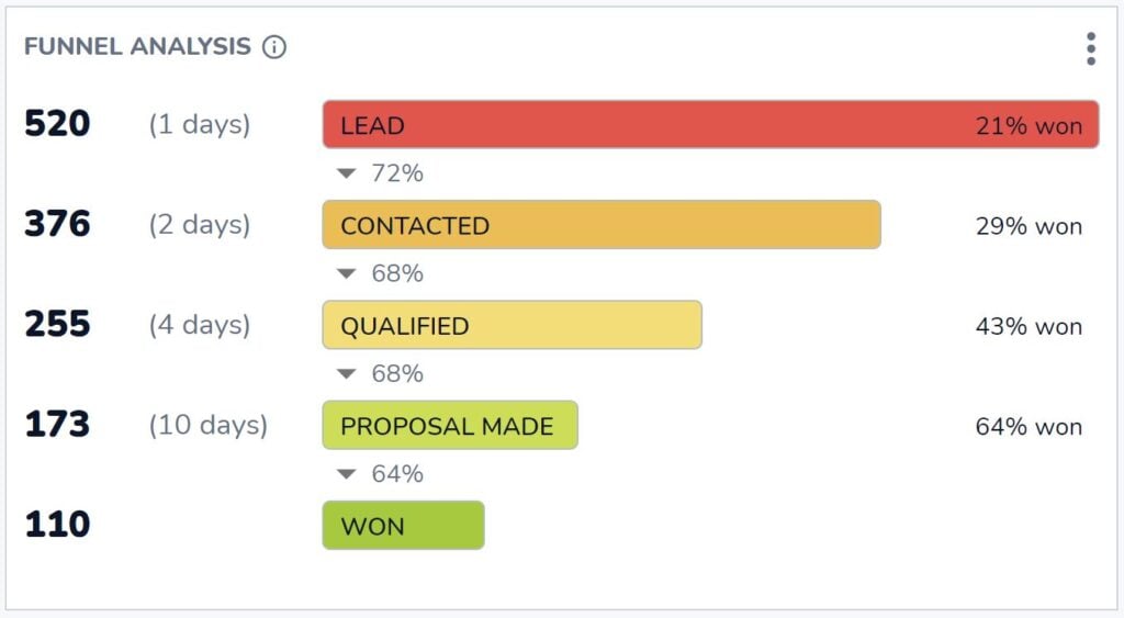
Combien d'opportunités atteignent l'étape gagnée ? Et de combien d'opportunités avez-vous besoin à chaque étape précédente pour obtenir ce résultat ?
C'est à cela que l'indispensable analyse de l'entonnoir de Salesflare vous aide à répondre. Vous trouverez les réponses à ces questions essentielles dans le tableau de bord "Revenue" de Salesflare.
Ratio de clôture par membre de l'équipe (intégré)

Si vous voulez savoir qui est le rapprocheur le plus efficace, ce rapport est fait pour vous.
Vous pouvez le trouver dans le tableau de bord "Team" de Salesflare.
# Opportunités gagnées vs perdues par mois (sur mesure)

Comment votre taux de clôture évolue-t-il au fil du temps ? Dans quelle mesure dépend-il du nombre total d'opportunités gagnées ou perdues ? Peut-être que certains mois, vous avez simplement plus de pistes, mais pas nécessairement plus de pistes qualifiées ?
C'est ce que vous pouvez constater en établissant un rapport sur les opportunités gagnées par rapport aux opportunités perdues par mois.
Pour construire ceci dans Salesflare, faites un rapport sur les "opportunités", appliquez le filtre du tableau de bord à la "date de clôture", choisissez un "diagramme à barres" pour le représenter, mesurez les "opportunités #" (axe x), visualisez par la "date de clôture de l'opportunité" (axe y), segmentez par "étape de l'opportunité", et filtrez pour n'afficher que les étapes qui sont "gagnées OU perdues" (barre latérale de droite).

Top Lost Reasons (intégré)

Voyons maintenant le "pourquoi". Pourquoi les opportunités sont-elles perdues ? C'est ainsi que nous saurons comment nous améliorer.
Ce rapport est intégré au tableau de bord "Revenu" de Salesflare. Chaque fois que vous marquez une opportunité comme perdue, Salesflare vous demande quelle en est la raison.
À moins que vous ne désactiviez le champ "Raison de la perte" dans Paramètres > Personnaliser les champs > Opportunités > Champs prédéfinis, mais nous vous recommandons vivement de le laisser activé ! Ce rapport peut être une mine d'informations.
Principales raisons de la perte d'une opportunité par le propriétaire de l'opportunité (personnalisé)

En réalité, différentes personnes peuvent enregistrer des raisons différentes en raison de leurs préjugés. C'est pourquoi il est également utile d'indiquer les raisons perdues par membre de l'équipe.
Pour créer ce rapport dans Salesflare, faites un rapport sur les "opportunités", appliquez le filtre du tableau de bord à la "date de clôture", choisissez un "diagramme à barres" pour le représenter, mesurez les "opportunités #" (axe x), visualisez la "raison de la perte de l'opportunité" (axe y) et segmentez par le "propriétaire de l'opportunité".

5. Tableau de bord du cycle de vente
Nous avons analysé nos performances en long et en large, mais qu'en est-il de notre vitesse ? 🏎️

A quelle vitesse ces opportunités sont-elles traitées dans le pipeline ? Qui peut conclure des affaires plus rapidement ? Et où sont-elles généralement bloquées ?
Durée moyenne du cycle de vente (intégrée)

Quelle est la durée de votre cycle de vente, c'est-à-dire le temps qui s'écoule en moyenne entre la création d'une opportunité et sa conclusion ?
Ce rapport dans le tableau de bord "Revenus" de Salesflare répond exactement à cette question.
Durée moyenne du cycle de vente par propriétaire d'opportunité au fil du temps (personnalisé)

Ce rapport met en lumière la rapidité avec laquelle les différents membres de l'équipe parviennent à conclure des affaires et l'évolution de cette rapidité au fil du temps.
Pour créer ce rapport dans Salesflare, faites un rapport sur les "opportunités", appliquez le filtre du tableau de bord à la "date de clôture", choisissez un "diagramme à barres" pour le représenter, mesurez la "moyenne" du "cycle de vente des opportunités" (axe x), visualisez la "date de clôture de l'opportunité" (axe y), et segmentez par le "propriétaire de l'opportunité".
Ensuite, décochez la case "Empiler les segments" dans les options avancées (faites défiler jusqu'en bas), car cela n'a pas de sens d'empiler les moyennes.

Analyse de l'entonnoir
N'avons-nous pas déjà vu ce rapport ? Oui, nous l'avons vu !
Cette fois-ci, nous n'examinons pas les performances en matière de clôture, mais nous décomposons la durée de notre cycle de vente en fonction des différentes étapes.
Vous pouvez consulter ce rapport "d'analyse de l'entonnoir" sur le tableau de bord "Revenus" de Salesflare lorsque vous souhaitez savoir comment chaque étape contribue à la durée totale du cycle de vente.
6. Tableau de bord de l'activité commerciale
Jusqu'à présent, nous avons mesuré les résultats et les performances. Maintenant, mesurons l'input, c'est-à-dire l'activité de vente ! ✉️📞📆

Coéquipier le plus actif (intégré)

Question simple : quel est votre coéquipier le plus actif ?
Ce tableau de bord standard est intégré au tableau de bord "Équipe" de Salesflare.
Activité par coéquipier : réunions, appels, courriels (intégré)

Vous voulez savoir comment se décompose cette activité ?
Répartissez l'activité par personne en fonction des courriels envoyés, des appels passés et des réunions avec les clients.
Salesflare suit automatiquement tous ces éléments et sait quelles activités sont liées à des comptes/clients et lesquelles ne le sont pas.
# Opportunités d'affaires (sur mesure)

Pour savoir combien d'opportunités correspondent à un certain niveau d'intérêt et d'activité, ce rapport peut être utile.
Dans Salesflare, les opportunités sont automatiquement marquées comme "chaudes" ou "en feu" en fonction de l'ouverture des e-mails, des clics sur les liens, des visites sur le site Web et de l'activité des e-mails.
Pour créer un rapport dans Salesflare afin de compter le nombre de leads chauds à tout moment, rapportez sur les "opportunités", appliquez le filtre du tableau de bord à la "date de clôture", choisissez un "scorecard" pour le représenter, mesurez par les "opportunités #", et filtrez par la "chaleur du compte" pour ne compter que les opportunités liées à des comptes "chauds OU en feu".
Si vous ne souhaitez pas compter uniquement les opportunités dont la "date de clôture" se situe dans la période sélectionnée, descendez jusqu'aux options avancées et cochez "Ne pas appliquer le filtre temporel du tableau de bord".

7. Tableau de bord des recettes d'abonnement
Si vous vendez des abonnements, il est indispensable de disposer d'un moyen de rendre compte de vos recettes d'abonnement.

N'attendez rien de trop complexe du suivi des revenus d'abonnement dans un CRM. Il existe des solutions spécialisées dans ce domaine, comme ProfitWell, ChartMogul et Baremetrics.
Néanmoins, il est bon de disposer d'un rapport de base sur les revenus d'abonnement dans votre système de gestion de la relation client.
Voyons ce qu'il est possible de faire. 👇
Revenu mensuel récurrent (MRR) (intégré, optionnel)

Si vous vendez un produit SaaS ou un autre type de produit ou de service par abonnement, la croissance de vos revenus mensuels récurrents (MRR) peut être la principale chose que vous suivez.
Salesflare dispose d'un rapport MRR intégré au tableau de bord "Revenu". Pour que le rapport apparaisse, activez l'option "revenus récurrents" dans le pipeline, comme indiqué ci-dessous.

MRR par compte (personnalisé)

Enfin, il peut être intéressant de déterminer quels sont vos principaux comptes en termes de revenus mensuels récurrents et quelle est la contribution de chacun d'entre eux.
Pour créer ce rapport dans Salesflare, faites un rapport sur les "opportunités", appliquez le filtre du tableau de bord à la "date de clôture", choisissez un "diagramme à barres" pour le représenter, mesurez la "somme" des "revenus récurrents de l'opportunité" (axe x), visualisez par le "nom du compte" (axe y), et filtrez par le "stade" pour n'inclure que les opportunités "gagnées" (barre latérale de droite).
Magie ✨

Fournisseurs de tableaux de bord de vente
Vous souhaitez mettre en place l'un des éléments ci-dessus et ne savez pas quel logiciel utiliser ? Voici quelques-uns des principaux fournisseurs de tableaux de bord de vente.
Salesflare
Salesflare ne se contente pas de faciliter l'élaboration de tableaux de bord commerciaux. Il facilite également le suivi des données sur lesquelles vous baserez ces tableaux de bord.
Le logiciel se base sur les informations déjà présentes dans les boîtes de réception, les calendriers, etc. de l'équipe de vente et veille à ce que ces données soient facilement suivies. Ainsi, vous ne pouvez pas vous contenter de assurer le suivi de vos clients potentiels Mais vous pouvez également élaborer des tableaux de bord, connaître vos résultats et vous améliorer en conséquence.
Les tableaux de bord standard qui couvrent les besoins les plus courants sont disponibles sur le plan Growth ($29-35/utilisateur/mois) et les tableaux de bord et rapports personnalisés sont disponibles sur le plan Pro ($49-55/utilisateur/mois).
HubSpot
HubSpot est un autre système CRM doté de fortes capacités de création de tableaux de bord pour les ventes. HubSpot offre une suite complète d'outils qui permettent aux équipes de vente de créer des tableaux de bord détaillés. Ces tableaux de bord permettent de suivre un grand nombre de paramètres, notamment les performances de vente, la gestion du pipeline et les interactions avec les clients. Les tableaux de bord de HubSpot sont hautement personnalisables, ce qui permet aux utilisateurs de les adapter à leurs besoins spécifiques.
L'analyse et la prévision des ventes sont disponibles sur le plan Sales Hub Professional ($90-100/utilisateur/mois), tandis que des fonctionnalités telles que le suivi des revenus récurrents ne sont disponibles que sur le plan Sales Hub Enterprise (à partir de $150/utilisateur/mois).
Geckoboard
Geckoboard est un outil de tableau de bord dédié qui s'intègre à diverses sources de données pour fournir des informations en temps réel. Il est conçu pour être facile à utiliser, avec une interface de type "glisser-déposer" qui facilite la création de tableaux de bord. Geckoboard s'intègre à un large éventail de systèmes CRM, d'outils marketing et d'autres sources de données, ce qui permet aux équipes de vente de suivre les indicateurs clés de performance en temps réel.
Les prix commencent à $39-49/mois pour le plan Essential, qui comprend les fonctionnalités et les intégrations de base, tandis que pour les intégrations CRM et des taux de rafraîchissement des données plus élevés, vous devez passer au plan Pro ($79-99/mois) ou au plan Scale ($559-699/mois).
Microsoft Power BI
Microsoft Power BI est un puissant outil d'analyse commerciale qui offre des visualisations interactives et des capacités de veille stratégique. Il permet aux utilisateurs de créer des tableaux de bord qui combinent des données provenant de diverses sources, notamment des systèmes CRM, des bases de données et des feuilles de calcul. Power BI est connu pour ses solides capacités d'analyse et de visualisation des données, ce qui en fait un choix populaire pour les équipes de vente qui ont besoin d'analyser des ensembles de données complexes.
La tarification de Power BI commence avec le plan Pro à $10/utilisateur/mois, qui comprend des fonctionnalités de BI en libre-service, et va jusqu'au plan Premium (à partir de $20/utilisateur/mois) pour des analyses avancées et des déploiements à plus grande échelle.
FAQ
Que comprend un tableau de bord des ventes ?
Un tableau de bord des ventes comprend un ensemble de rapports et d'indicateurs clés de performance (ICP) qui visualisent vos activités et vos performances commerciales. Il est généralement organisé autour de thèmes spécifiques, tels que le tableau de bord de la génération de leads (suivi des nouvelles opportunités), le tableau de bord du chiffre d'affaires (suivi des contrats remportés et du chiffre d'affaires) et le tableau de bord des prévisions de ventes (prévision du chiffre d'affaires futur).
Comment créer un tableau de bord des ventes ?
Pour créer un tableau de bord des ventes, vous utilisez généralement un système de gestion de la relation client (CRM) ou un outil de tableau de bord spécialisé. Le processus consiste à créer des rapports individuels en sélectionnant les données à mesurer (par exemple, les opportunités), en choisissant un type de graphique (comme un diagramme à barres ou un tableau de bord), en définissant ce qui doit être affiché sur chaque axe (par exemple, la valeur par date) et en appliquant des filtres (par exemple, pour une période de temps ou une étape de vente spécifique). Ces rapports sont ensuite regroupés dans un tableau de bord unique.
Quels sont les 4 types de tableaux de bord ?
Dans le domaine de la veille stratégique, les tableaux de bord sont généralement classés en quatre catégories principales :
- Tableaux de bord stratégiques : Fournir aux cadres une vue d'ensemble de haut niveau des objectifs et des performances à long terme de l'entreprise.
- Tableaux de bord analytiques : Utilisé par les analystes de données pour explorer les données, identifier les tendances et découvrir des informations.
- Tableaux de bord opérationnels : Surveillez les activités opérationnelles en temps réel afin de suivre les performances et d'identifier les problèmes immédiats. Un tableau de bord des activités de vente en est un bon exemple.
- Tableaux de bord tactiques : Utilisé par les cadres moyens pour suivre les performances par rapport aux objectifs et tactiques spécifiques du département.
Comment créer un tableau de bord de rapports de vente dans Excel ?
Pour créer un tableau de bord des ventes dans Excel, commencez par organiser toutes vos données de vente dans un tableau structuré. Ensuite, vous pouvez utiliser les tableaux croisés dynamiques pour résumer les données et créer divers graphiques (tels que des diagrammes à barres, des diagrammes linéaires et des diagrammes circulaires) à partir de ces résumés. Enfin, vous organisez tous ces graphiques sur une seule feuille de calcul qui servira de tableau de bord. Ce processus est manuel et nécessite une mise à jour constante des données sources.
Quel est le meilleur CRM pour les tableaux de bord commerciaux ?
Le meilleur CRM pour les tableaux de bord commerciaux est celui qui non seulement facilite la création de rapports, mais aussi automatise la collecte des données qui les alimentent. Un CRM comme Salesflare excelle dans ce domaine car il enregistre automatiquement les activités de votre équipe à partir de leurs e-mails, de leur calendrier et de leur téléphone. Cela garantit que les données de vos tableaux de bord sont toujours exactes et à jour sans nécessiter d'effort manuel, vous donnant ainsi des informations auxquelles vous pouvez vous fier.
Oof, c'était une longue liste d'exemples de tableaux de bord de vente (et de fournisseurs) ! 😅 Les possibilités sont vraiment infinies...
Si vous êtes arrivé jusqu'ici, félicitations 🙌 Nous espérons que vous avez trouvé une bonne source d'inspiration pour élaborer davantage de rapports et obtenir des informations plus approfondies.
Autre chose que vous aimeriez construire ou savoir ? Demandez simplement à notre équipe en utilisant le chat sur salesflare.com. Nous sommes là pour vous aider 😄

Nous espérons que cet article vous a plu. Si c'est le cas, passez le mot !
👉 Vous pouvez suivre @salesflare sur Twitter, Facebook et LinkedIn.
Dernière mise à jour :
- Les 8 meilleurs CRM pour Gmail + leurs principales fonctionnalités - 25 juin 2026
- Les 8 meilleurs CRM pour les startups en 2026 - 15 juin 2026
- 8 Best Simple CRMs in 2026 - avril 29, 2026