7 Beispiele für Vertriebs-Dashboards (30 Berichte) und wie man sie erstellt
Wir verschaffen Ihnen einen Einblick in den Verkauf 💡.
Sie möchten mit der Erstellung von Vertriebs-Dashboards beginnen, wissen aber nicht, wo Sie anfangen sollen? 🤔
Wir haben einen relativ umfassenden Satz von Vertriebs-KPIs/Metriken in 7 separate Vertriebs-Dashboards unterteilt. Zu jedem Dashboard gibt es Beispielberichte und weitere Details, warum sie wichtig sind.
Für diejenigen, die Salesflare verwenden oder verwenden möchten, werden wir detailliert aufzeigen, welche Berichte eingebaut sind und welche selbst erstellt werden können. 👷♂️
Hier sind die 7 Vertriebs-Dashboards, die wir untersuchen werden:
- Generierung von Leads
- Umsatzprognose
- Umsatzerlöse
- Leistung beim Verkaufsabschluss
- Verkaufszyklus
- Verkaufstätigkeit
- Wiederkehrende Einnahmen
Sie können sofort zu einem bestimmten Thema klicken 👆 oder unten von Anfang an beginnen 👇.
Willkommen in der wunderbaren Welt der Verkaufsberichte 🔮
Welchen Umfang haben die einzelnen Dashboards für den Vertrieb?
Mit unseren "beeindruckenden" PowerPoint-Kenntnissen haben wir versucht, dies für Sie zu visualisieren. 👇

Kurz gesagt:
- Die Lead-Generierung füllt unsere Vertriebspipeline.
- Verkaufstätigkeit schiebt Ihre Leads durch.
- Am Ende der Pipeline schließen Sie sie.
- Messen Sie die Dauer Ihres Verkaufszyklus, um Ihre Geschwindigkeit zu ermitteln.
- Prognostizieren Sie Ihre Einnahmen aus der Pipeline, um Ihre Einnahmen vorherzusagen.
- Und dann messen Sie Ihre Verkaufserlöse (die wiederkehrende Einnahmen sein können).
Macht das Sinn? 😁 Fangen wir an, nach Erkenntnissen zu graben! ⛏️
1. Dashboard zur Lead-Generierung
Beginnen wir am Anfang Ihrer Vertriebspipeline. Sie wissen schon 😁, dieses Ding:

Wenn Sie beständig Einnahmen erzielen wollen, müssen Sie sie auch beständig füllen. Unser erstes Vertriebs-Dashboard wird Ihnen dabei helfen, zu messen, wie gut Sie in dieser Hinsicht vorankommen... und wie Sie es tatsächlich schaffen.
Übrigens, wir sind jetzt hier:

# Neue Möglichkeiten (eingebaut)

Die einfachste Möglichkeit, die Anzahl der von Ihnen generierten Leads zu ermitteln, besteht darin, die Anzahl der neuen Opportunities in Ihrer Pipeline zu zählen.
Sie finden diesen Bericht in Salesflare auf dem integrierten Dashboard "Einnahmen".
# Neue Konten (benutzerdefiniert)

Wenn Sie nicht sofort für jeden neuen Lead eine Verkaufschance erstellen (was wir eigentlich empfehlen würden), können Sie alternativ die Anzahl der neu erstellten Konten als Maßstab verwenden.
Dieser Bericht ist in Salesflare sehr einfach zu erstellen: Erstellen Sie einfach einen Bericht über die Entität "Konten", wenden Sie den Dashboard-Zeitfilter auf das "Erstellungsdatum" an, und verwenden Sie eine "Scorecard" als Diagrammtyp.

Gesamtwert der neuen Opportunities pro Monat (benutzerdefiniert)

Die Anzahl der neuen Leads, die Sie generieren, zu zählen, ist eine großartige Möglichkeit, Ihren Input zu messen und motiviert zu bleiben. Wenn Sie außerdem wissen möchten, wie hoch der Gesamtwert dieser neuen Leads ist (und wie sich dieser Wert im Laufe der Zeit entwickelt), dann ist dieser Bericht sehr nützlich.
Um es in Salesflare zu erstellen, berichten Sie über "Verkaufschancen" (1), wenden Sie den Dashboard-Filter auf das "Erstellungsdatum" an (2), wählen Sie ein "Säulendiagramm", um es darzustellen (3), betrachten Sie es nach dem "Erstellungsdatum der Verkaufschance" (x-Achse) (4) und messen Sie es nach der "Summe" (5) des "Verkaufschancenwerts" (y-Achse) (6).

Top-Lead-Quellen (integriert, optional)

Jetzt, da Sie wissen, wie viele Leads Sie einbringen und welchen Gesamtwert sie darstellen, bleibt die Frage: Welche Lead-Generierungstaktiken bringen Ihnen die meisten Leads? 💰
Aus diesem Grund sollten Sie die "Lead-Quelle" jeder neuen Geschäftsmöglichkeit verfolgen. Auf diese Weise erhalten Sie Einblicke in die Bereiche, die Ihnen die meisten Leads bescheren, sodass Sie entweder auf das setzen können, was funktioniert, oder neue Wege der Lead-Generierung erkunden können.
Da die meisten Leute die Lead-Quellen nicht nachverfolgen und wir die Dinge in Salesflare gerne sauber halten, haben wir diese Option standardmäßig deaktiviert, aber vollständig integriert, so dass Sie das Feld unter Einstellungen > Felder anpassen > Opportunity > Vordefinierte Felder aktivieren können, wann immer Sie bereit sind (mehr Informationen dazu hier).
Der obige Bericht wird dann automatisch in Ihrem integrierten Dashboard "Einnahmen" angezeigt.
Gesamtwert der neuen Opportunities pro Lead-Quelle (benutzerdefiniert)

Dieser Bericht ist eine Kombination aus den beiden vorangegangenen: Er misst den Gesamtwert der neuen Opportunities, aber diesmal nach Lead-Quelle (und segmentiert nach Land).
Sie können es in Salesflare wie folgt aufbauen: berichten Sie über "Verkaufschancen", wenden Sie den Dashboard-Filter auf das "Erstellungsdatum" an, wählen Sie ein "Säulendiagramm", um es darzustellen, betrachten Sie es nach der "Lead-Quelle der Verkaufschance" (x-Achse) und messen Sie es nach der "Summe" des "Verkaufschancenwertes" (y-Achse).
Wir haben sie hier zusätzlich nach "Kontoland" segmentiert, damit wir prüfen können, wie jedes Land vertreten ist (Sie können mit dem Mauszeiger über die Balken in Salesflare fahren, um weitere Informationen über diese Segmente und ihre Größe zu erhalten).

2. Dashboard für Absatzprognosen
Wenn wir wissen, wie viele Leads auf welche Weise generiert werden, können wir etwas weiter in unsere Pipeline schauen und damit beginnen, zu verfolgen, wie viel Umsatz sie voraussichtlich bringen wird, indem wir eine Verkaufsprognose erstellen. 📈

Voraussichtliche Einnahmen: Erwartete Einnahmen (eingebaut)

Dieser Bericht hilft Ihnen herauszufinden, ob Sie das Ziel erreichen werden... oder nicht.
Er addiert die Einnahmen, die Sie bereits erzielt haben, und die Einnahmen, die Sie in der aktuellen Periode voraussichtlich abschließen werden. Dieser erwartete Umsatz wird berechnet, indem die Werte der Opportunities, die Sie in diesem Zeitraum voraussichtlich abschließen werden, mit den Wahrscheinlichkeiten, dass Sie sie gewinnen, multipliziert werden.
Während Umsatzprognosen als Funktion im Pro/Professional Paket der meisten Kleinunternehmens-CRM-Software enthalten ist, wird sie als integrierter Bericht (im Dashboard "Umsatz") im günstigsten Wachstumsplan von Salesflare angeboten, so dass jeder leicht davon profitieren kann.
Erwartete Umsätze aus offenen Opportunities pro Monat (benutzerdefiniert)

Sie möchten wissen, wann Sie diese Einnahmen voraussichtlich abschließen werden? Sehen Sie sich einfach die erwarteten Einnahmen nach ihrem voraussichtlichen Abschlussdatum an. ⏱️
Um es in Salesflare zu erstellen, berichten Sie über "Opportunities", wenden Sie den Dashboard-Filter auf das "Abschlussdatum" an, wählen Sie ein "Säulendiagramm" zur Darstellung, betrachten Sie es nach dem "Abschlussdatum der Opportunity" (x-Achse) und messen Sie es nach der "Summe" des "Erwartungswertes der Opportunity" (y-Achse).
Um nur die erwarteten Einnahmen aus offenen Opportunities zu berücksichtigen, filtern Sie die Opportunities auch nach Stadium. Schließen Sie gewonnene, verlorene und alle anderen Stadien aus, die Sie hinter diesen erstellt haben.

Erwartete Einnahmen nach Stufe (kundenspezifisch)

Wenn Sie sich fragen, wo in Ihrer Pipeline das Umsatzpotenzial versteckt ist, dann ist dieser Bericht genau das Richtige für Sie. 👀
Um ihn in Salesflare zu erstellen, können Sie den obigen Bericht duplizieren und eine Änderung vornehmen: Messen Sie nach dem "Opportunity-Stadium".
Um es von Grund auf neu zu erstellen: Erstellen Sie einen Bericht über "Verkaufschancen", wenden Sie den Dashboard-Filter auf das "Abschlussdatum" an, wählen Sie ein "Säulendiagramm", um es darzustellen, betrachten Sie es nach dem "Stadium der Verkaufschance" (x-Achse) und messen Sie es nach der "Summe" des "Erwartungswertes der Verkaufschance" (y-Achse). Filtern Sie dann (auf der rechten Seite), um nur die ersten Phasen zu berücksichtigen.

Erwartete Einnahmen pro Land (Zoll)

Wenn Sie schließlich wissen möchten, in welchen Ländern Sie diese Einnahmen erzielen werden, können Sie diesen Bericht erstellen. 🌍
Sie können einen der beiden obigen Berichte einfach duplizieren, in ein "Tortendiagramm" umwandeln und nach "Kontoland" segmentieren.
So erstellen Sie es von Grund auf: Erstellen Sie einen Bericht über "Verkaufschancen", wenden Sie den Dashboard-Filter auf das "Abschlussdatum" an, wählen Sie ein "Tortendiagramm" zur Darstellung, messen Sie die "Summe" des "erwarteten Werts der Verkaufschance" und segmentieren Sie nach "Kontoland". Filtern Sie dann (auf der rechten Seite), um nur die ersten Phasen einzubeziehen.

3. Dashboard der Umsatzerlöse
Bisher haben wir neue Leads gemessen und Vorhersagen über den erwarteten Umsatz gemacht. Jetzt ist es an der Zeit, die Ergebnisse zu messen.

Wir werden Fragen wie diese beantworten:
- Wie viele Geschäfte schließen wir ab?
- Wer macht sie zu?
- Wie hoch ist der durchschnittliche Wert pro Geschäft?
- Wer sind unsere wichtigsten Kunden?
- Und was sind unsere Top-Produkte?
Fangen wir an 👇
# Gewonnene Chancen (eingebaut)

Möchten Sie die Anzahl der gewonnenen Chancen zählen? 🔢
Dieser Bericht ist in das Dashboard "Einnahmen" in Salesflare integriert.
# Gewonnene Opportunities nach Opportunity-Eigentümer pro Monat (benutzerdefiniert)

Um zu sehen, wie jede Person im Laufe der Zeit zur Anzahl der gewonnenen Opportunities beiträgt, können Sie diesen Bericht erstellen.
Um dies in Salesflare zu tun, berichten Sie über "Verkaufschancen", wenden Sie den Dashboard-Filter auf das "Abschlussdatum" an, wählen Sie ein "Balkendiagramm", um es darzustellen, messen Sie nach "# Verkaufschancen" (x-Achse), betrachten Sie nach dem "Abschlussdatum der Verkaufschance" (y-Achse), segmentieren Sie nach dem "Eigentümer der Verkaufschance" und filtern Sie nach der Stufe "gewonnen" (rechte Seitenleiste).

Wenn Sie die Balkensegmente nicht gestapelt, sondern nebeneinander sehen möchten, blättern Sie zu den "Erweiterten Optionen" und deaktivieren Sie die Option "Segmente stapeln".
Durchschnittlicher Wert der gewonnenen Opportunities (eingebaut)

Es kann interessant sein zu sehen, wie groß Ihre Geschäfte im Durchschnitt sind... und wie sich das entwickelt. 📊
Salesflare zeigt diesen Bericht standardmäßig im Standard-Dashboard "Einnahmen" an.
Durchschnittlicher Wert der gewonnenen Opportunities nach Opportunity-Eigentümer (benutzerdefiniert)

Sie kennen also Ihren durchschnittlichen Geschäftsumfang, wissen aber nicht, wie sich dieser bei den einzelnen Teammitgliedern unterscheidet. Lassen Sie uns das herausfinden! 🤓
Um den Bericht in Salesflare zu erstellen, erstellen Sie einen Bericht über "Verkaufschancen", wenden Sie den Dashboard-Filter auf das "Abschlussdatum" an, wählen Sie ein "Balkendiagramm" zur Darstellung, messen Sie den "Wert der Verkaufschance" (x-Achse), betrachten Sie den "Eigentümer der Verkaufschance" (y-Achse) und filtern Sie nach der Stufe "gewonnen" (rechte Seitenleiste). Erledigt!

Topverdienende Konten: Tabelle (eingebaut)

Wenn Sie wissen wollen, wer Ihre besten Kunden in Bezug auf die im aktuellen Zeitraum erzielten Einnahmen sind, benötigen Sie einen Bericht über die "umsatzstärksten Kunden".
Salesflare zeigt dies standardmäßig im Dashboard "Einnahmen" an, das sofort einsatzbereit ist.
Topverdienende Konten: Balkendiagramm (benutzerdefiniert)

Ihnen gefällt die obige Darstellung, aber Sie möchten lieber ein Diagramm statt einer Tabelle sehen? Wir hören Sie! 🙌
Um diesen Bericht in Salesflare zu erstellen, erstellen Sie einen Bericht über "Verkaufschancen", wenden Sie den Dashboard-Filter auf das "Abschlussdatum" an, wählen Sie ein "Balkendiagramm" zur Darstellung, messen Sie die "Summe" des "Verkaufschancenwerts" (x-Achse), betrachten Sie den "Kontonamen" (y-Achse) und filtern Sie nach der Stufe "gewonnen" (rechte Seitenleiste).
Dann bekommen Sie das 👇.

Rangliste (eingebaut)

Wenn Sie sehen möchten, wie gut jeder im Vergleich zu seiner Umsatzquote abschneidet, benötigen Sie ein Leaderboard. Die Teammitglieder mit dem höchsten Gesamtumsatz im Vergleich zur Quote werden in der Regel ganz oben aufgeführt.
Salesflare bietet dies im Dashboard "Team" an. Sie müssen es nicht selbst erstellen.
Umsatz pro Produkt (kundenspezifisch)

Wenn Sie verschiedene Produkte verkaufen, kann es auch nützlich sein, Ihre Einnahmen nach Produkten zu trennen.
Um damit zu beginnen, müssen Sie natürlich zunächst Ihre Einnahmen nach Produkten aufschlüsseln. In Salesflare können Sie einfach ein benutzerdefiniertes Feld namens "Produkt" vom Typ "Dropdown" erstellen.
Um den Bericht in Salesflare zu erstellen, erstellen Sie einen Bericht über "Verkaufschancen", wenden Sie den Dashboard-Filter auf das "Abschlussdatum" an, wählen Sie ein "Balkendiagramm" zur Darstellung, messen Sie die "Summe" des "Verkaufschancenwerts" (x-Achse), betrachten Sie das benutzerdefinierte Feld "Produkt" (y-Achse) und filtern Sie nach der Stufe "gewonnen" (rechte Seitenleiste).
Und, bumm, da haben Sie es... Sie können sehen, welches Ihr Top-Produkt ist!

4. Dashboard für die Verkaufsabschlussleistung
Lassen Sie uns jetzt Ihre Abschlussleistung näher betrachten.

Wie viele der neu generierten Leads werden gewonnen? Wer ist besser im Abschluss? Und warum gehen sie verloren? 🤔
Dies sind einige der wichtigen Fragen, die wir versuchen werden zu beantworten.
Trichteranalyse
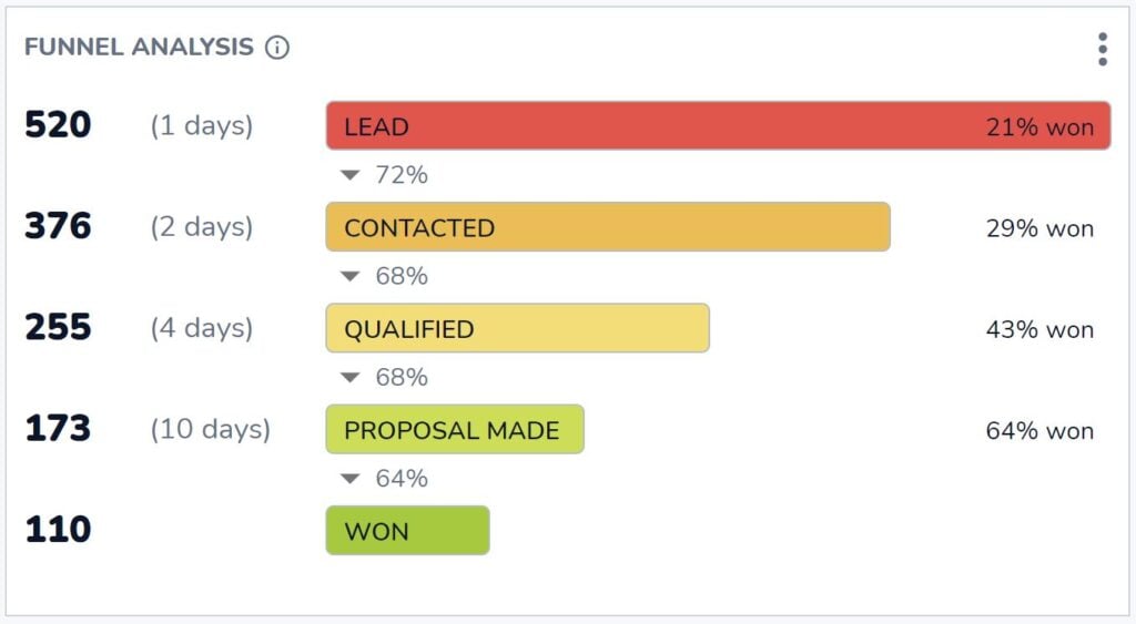
Wie viele Chancen erreichen die Gewinnstufe? Und wie viele Chancen brauchen Sie in jeder vorangegangenen Phase, um dieses Ergebnis zu erreichen?
Bei der Beantwortung dieser Fragen hilft Ihnen die unverzichtbare Trichteranalyse in Salesflare. Die Antworten auf diese wichtigen Fragen finden Sie direkt im Dashboard "Umsatz" von Salesflare.
Abschlussquote pro Teammitglied (eingebaut)

Wenn Sie wissen wollen, wer der effizienteste Schließer ist, dann ist dies der Bericht, den Sie suchen.
Sie finden es im Dashboard "Team" in Salesflare.
# Gewonnene und verlorene Opportunities pro Monat (benutzerdefiniert)

Wie verändert sich nun Ihre Abschlussquote im Laufe der Zeit? Und inwieweit ist sie abhängig von der Gesamtzahl der gewonnenen oder verlorenen Opportunities? Vielleicht haben Sie in manchen Monaten einfach mehr Leads, aber nicht unbedingt mehr qualifizierte Leads?
Das können Sie sehen, wenn Sie über gewonnene und verlorene Opportunities pro Monat berichten.
Um dies in Salesflare zu erstellen, erstellen Sie einen Bericht über "Verkaufschancen", wenden Sie den Dashboard-Filter auf das "Abschlussdatum" an, wählen Sie ein Balkendiagramm zur Darstellung, messen Sie die "# Verkaufschancen" (x-Achse), betrachten Sie das "Abschlussdatum der Verkaufschance" (y-Achse), segmentieren Sie nach dem "Stadium der Verkaufschance" und filtern Sie, um nur die Stadien anzuzeigen, die "gewonnen ODER verloren" wurden (rechte Seitenleiste).

Top Lost Reasons (eingebaut)

Lassen Sie uns nun dem "Warum" auf den Grund gehen. Warum werden Chancen verpasst? Auf diese Weise wissen wir, wie wir uns verbessern können.
Dieser Bericht ist in das Dashboard "Umsatz" in Salesflare integriert. Wann immer Sie eine Verkaufschance als verloren markieren, fragt Salesflare nach dem Grund.
Es sei denn, Sie deaktivieren das Feld "Grund für den Verlust" unter Einstellungen > Felder anpassen > Verkaufschancen > Vordefinierte Felder, aber wir empfehlen Ihnen auf jeden Fall, es aktiviert zu lassen! Dieser Bericht kann eine wahre Fundgrube für Erkenntnisse sein.
Die wichtigsten Gründe für den Verlust nach Opportunity-Eigentümer (benutzerdefiniert)

Die Wahrheit ist, dass verschiedene Personen aufgrund ihrer Voreingenommenheit unterschiedliche Gründe aufzeichnen können. Deshalb ist es auch sinnvoll, die verlorenen Gründe nach Teammitgliedern aufzuschlüsseln.
Um diesen Bericht in Salesflare zu erstellen, berichten Sie über "Verkaufschancen", wenden Sie den Dashboard-Filter auf das "Abschlussdatum" an, wählen Sie ein "Balkendiagramm", um es darzustellen, messen Sie die "# Verkaufschancen" (x-Achse), betrachten Sie den "Grund für den Verlust der Verkaufschance" (y-Achse) und segmentieren Sie nach dem "Eigentümer der Verkaufschance".

5. Dashboard zum Verkaufszyklus
Wir haben unsere Leistung jetzt ausführlich analysiert, aber wie sieht es mit unserer Geschwindigkeit aus? 🏎️

Wie schnell bearbeiten wir diese Opportunities in der Pipeline? Wer kann Geschäfte schneller abschließen? Und wo bleiben sie normalerweise stecken?
Durchschnittliche Dauer des Verkaufszyklus (eingebaut)

Wie lang ist Ihr Verkaufszyklus, d.h. wie lange dauert es im Durchschnitt von der Eröffnung einer Verkaufschance bis zu deren Abschluss als gewonnen?
Dieser Bericht im Dashboard "Einnahmen" in Salesflare beantwortet genau diese Frage.
Durchschnittliche Dauer des Verkaufszyklus nach Opportunity-Eigentümer im Zeitverlauf (benutzerdefiniert)

Dieser Bericht gibt Aufschluss darüber, wie schnell verschiedene Teammitglieder Geschäfte abschließen können und wie sich dies im Laufe der Zeit ändert.
Um diesen Bericht in Salesflare zu erstellen, berichten Sie über "Verkaufschancen", wenden Sie den Dashboard-Filter auf das "Abschlussdatum" an, wählen Sie ein "Balkendiagramm" zur Darstellung, messen Sie den "durchschnittlichen" "Verkaufszyklus" der Verkaufschance (x-Achse), betrachten Sie das "Abschlussdatum" der Verkaufschance (y-Achse) und segmentieren Sie nach dem "Eigentümer der Verkaufschance".
Deaktivieren Sie anschließend die Option "Segmente stapeln" in den erweiterten Optionen (scrollen Sie ganz nach unten), da es wenig sinnvoll ist, Durchschnittswerte zu stapeln.

Trichteranalyse
Hatten wir diesen Bericht nicht schon einmal gesehen? Ja, das haben wir!
Diesmal geht es nicht um die Abschlussleistung, sondern um die Aufschlüsselung der Länge des Verkaufszyklus nach Phasen.
Sie können diesen "Trichteranalyse"-Bericht auf dem Dashboard "Umsatz" in Salesflare abrufen, wenn Sie wissen möchten, wie jede Phase zur Gesamtlänge des Verkaufszyklus beiträgt.
6. Dashboard für Verkaufsaktivitäten
Bis jetzt haben wir den Output und die Leistung gemessen. Jetzt messen wir den Input, d. h. die Verkaufsaktivität! ✉️📞📆

Aktivster Teamkollege (eingebaut)

Einfache Frage: Wer ist Ihr aktivster Teamkollege?
Diese Standard-Scorecard ist in das Dashboard "Team" in Salesflare integriert.
Aktivität pro Teammitglied: Sitzungen, Anrufe, E-Mails (integriert)

Möchten Sie wissen, wie sich diese Tätigkeit zusammensetzt?
Teilen Sie die Aktivitäten pro Person nach versendeten E-Mails, getätigten Anrufen und Treffen mit Kunden auf.
Salesflare verfolgt all diese Vorgänge automatisch und weiß, welche Aktivitäten mit Konten/Kunden verbunden sind und welche nicht.
# Heiße Gelegenheiten (benutzerdefiniert)

Um herauszufinden, wie viele Möglichkeiten ein bestimmtes Interessen- und Aktivitätsniveau überschreiten, kann dieser Bericht helfen.
In Salesflare werden Opportunities auf der Grundlage von E-Mail-Öffnungen, Link-Klicks, Website-Besuchen und E-Mail-Aktivitäten automatisch als "heiß" oder "brennend" markiert.
Um einen Bericht in Salesflare zu erstellen, der die Anzahl der heißen Leads zu jeder Zeit zählt, erstellen Sie einen Bericht über "Opportunities", wenden Sie den Dashboard-Filter auf das "Abschlussdatum" an, wählen Sie eine "Scorecard", um sie darzustellen, messen Sie die "# Opportunities" und filtern Sie nach der "Account Hotness", um nur Opportunities zu zählen, die mit "heißen ODER brennenden" Accounts verbunden sind.
Wenn Sie nicht nur Opportunities mit einem "Abschlussdatum" im ausgewählten Zeitraum zählen möchten, scrollen Sie nach unten zu den erweiterten Optionen und markieren Sie "Den Dashboard-Zeitfilter nicht anwenden".

7. Dashboard für Abonnementeinnahmen
Wenn Sie Abonnements verkaufen, ist eine Möglichkeit, über Ihre Abonnementeinnahmen Bericht zu erstatten, ein Muss.

Erwarten Sie von der Nachverfolgung der Abonnementeinnahmen in einem CRM nichts allzu Komplexes. Hierfür gibt es spezialisierte Lösungen wie ProfitWell, ChartMogul und Baremetrics.
Dennoch ist es gut, wenn Sie in Ihrem CRM über einige grundlegende Berichte zu den Abonnementeinnahmen verfügen.
Schauen wir uns an, was möglich ist. 👇
Monatlich wiederkehrende Einnahmen (MRR) (integriert, optional)

Wenn Sie ein SaaS-Produkt oder eine andere Art von Abonnement-Produkt oder -Dienstleistung verkaufen, ist das Wachstum Ihrer monatlich wiederkehrenden Einnahmen (MRR) vielleicht das Wichtigste, was Sie verfolgen.
Salesflare hat MRR-Berichte in das Dashboard "Umsatz" integriert. Damit der Bericht erscheint, aktivieren Sie "Wiederkehrende Einnahmen" in der Pipeline wie unten gezeigt.

MRR pro Konto (benutzerdefiniert)

Nicht zuletzt kann es interessant sein, herauszufinden, welches Ihre wichtigsten Kunden in Bezug auf die monatlich wiederkehrenden Einnahmen sind und wie sie jeweils dazu beitragen.
Um diesen Bericht in Salesflare zu erstellen, erstellen Sie einen Bericht über "Verkaufschancen", wenden Sie den Dashboard-Filter auf das "Abschlussdatum" an, wählen Sie ein "Balkendiagramm" für die Darstellung, messen Sie die "Summe" des "wiederkehrenden Umsatzes der Verkaufschance" (x-Achse), betrachten Sie den "Kontonamen" (y-Achse) und filtern Sie nach dem "Stadium", um nur "gewonnene" Verkaufschancen zu berücksichtigen (rechte Seitenleiste).
Magie ✨

Anbieter von Dashboards für den Vertrieb
Möchten Sie mit der Erstellung einiger der oben genannten Funktionen beginnen und wissen nicht, welche Software Sie verwenden sollen? Hier sind einige der besten Anbieter von Vertriebs-Dashboards.
Salesflare
Salesflare macht nicht nur die Erstellung von Vertriebs-Dashboards super einfach. Es macht es auch super einfach, die Daten zu verfolgen, auf denen diese Dashboards basieren.
Die Software basiert auf den Informationen, die bereits in den Posteingängen, Kalendern usw. des Vertriebsteams vorhanden sind, und sorgt dafür, dass diese Daten leicht nachverfolgt werden können. Auf diese Weise können Sie nicht nur Verfolgen Sie Ihre Leads Sie können aber auch Dashboards erstellen, um zu erfahren, wie Sie abschneiden, und sich entsprechend verbessern.
Standard-Dashboards, die die gängigsten Anforderungen abdecken, sind im Wachstumsplan ($29-35/Benutzer/Monat) verfügbar, und benutzerdefinierte Dashboards und Berichte sind im Pro-Plan ($49-55/Benutzer/Monat) zu finden.
HubSpot
Ein weiteres CRM-System mit starken Dashboarding-Funktionen für den Vertrieb ist HubSpot. HubSpot bietet eine umfassende Suite von Tools, mit denen Vertriebsteams detaillierte Dashboards erstellen können. Diese Dashboards können eine Vielzahl von Metriken verfolgen, darunter Vertriebsleistung, Pipeline-Management und Kundeninteraktionen. Die Dashboards von HubSpot sind in hohem Maße anpassbar, so dass die Benutzer sie auf ihre spezifischen Bedürfnisse zuschneiden können.
Vertriebsanalysen und -prognosen sind im Sales Hub Professional-Tarif ($90-100/Benutzer/Monat) verfügbar, während Funktionen wie die Verfolgung wiederkehrender Umsätze nur im Sales Hub Enterprise-Tarif (ab $150/Benutzer/Monat) enthalten sind.
Geckoboard
Geckoboard ist ein spezielles Dashboard-Tool, das mit verschiedenen Datenquellen integriert werden kann und Einblicke in Echtzeit bietet. Es ist benutzerfreundlich gestaltet und verfügt über eine Drag-and-Drop-Oberfläche, die die Erstellung von Dashboards vereinfacht. Geckoboard unterstützt Integrationen mit einer Vielzahl von CRM-Systemen, Marketing-Tools und anderen Datenquellen, sodass Vertriebsteams KPIs in Echtzeit überwachen können.
Die Preise beginnen bei $39-49/Monat für den Essential-Plan, der die wichtigsten Funktionen und Integrationen umfasst, während für CRM-Integrationen und höhere Datenaktualisierungsraten der Pro-Plan ($79-99/Monat) oder der Scale-Plan ($559-699/Monat) erforderlich ist.
Microsoft Power BI
Microsoft Power BI ist ein leistungsstarkes Tool für die Unternehmensanalyse, das interaktive Visualisierungen und Business Intelligence-Funktionen bietet. Es ermöglicht Benutzern, Dashboards zu erstellen, die Daten aus verschiedenen Quellen kombinieren, einschließlich CRM-Systemen, Datenbanken und Tabellenkalkulationen. Power BI ist für seine robusten Datenanalyse- und Visualisierungsfunktionen bekannt und daher eine beliebte Wahl für Vertriebsteams, die komplexe Datensätze analysieren müssen.
Die Preise für Power BI beginnen mit dem Pro-Tarif ($10/Benutzer/Monat), der umfassende Self-Service-BI-Funktionen umfasst, und reichen bis zum Premium-Tarif (ab $20/Benutzer/Monat) für erweiterte Analysen und größere Implementierungen.
FAQ
Was gehört zu einem Vertriebs-Dashboard?
Ein Vertriebs-Dashboard umfasst eine Sammlung von Berichten und Leistungsindikatoren (KPIs), die Ihre Vertriebsaktivitäten und -leistungen visualisieren. Es ist in der Regel nach bestimmten Themen gegliedert, z. B. ein Lead Generation Dashboard (Verfolgung neuer Opportunities), ein Sales Revenue Dashboard (Verfolgung gewonnener Geschäfte und Umsätze) und ein Sales Forecast Dashboard (Vorhersage zukünftiger Einnahmen).
Wie erstelle ich ein Vertriebs-Dashboard?
Um ein Vertriebs-Dashboard zu erstellen, verwenden Sie normalerweise ein CRM oder ein spezielles Dashboard-Tool. Dabei werden einzelne Berichte erstellt, indem Sie die Daten auswählen, die Sie messen möchten (z. B. Opportunities), einen Diagrammtyp wählen (z. B. ein Balkendiagramm oder eine Scorecard), festlegen, was auf jeder Achse angezeigt werden soll (z. B. Wert nach Datum), und Filter anwenden (z. B. für einen bestimmten Zeitraum oder eine bestimmte Verkaufsstufe). Diese Berichte werden dann in einer einzigen Dashboard-Ansicht angeordnet.
Was sind die 4 Arten von Dashboards?
In der Business Intelligence werden Dashboards im Allgemeinen in vier Haupttypen eingeteilt:
- Strategische Dashboards: Geben Sie den Führungskräften einen Überblick über die langfristigen Unternehmensziele und -leistungen.
- Analytische Dashboards: Wird von Datenanalysten verwendet, um Daten zu untersuchen, Trends zu erkennen und Erkenntnisse zu gewinnen.
- Operative Dashboards: Überwachen Sie operative Aktivitäten in Echtzeit, um die Leistung zu verfolgen und unmittelbare Probleme zu erkennen. Ein Dashboard für Vertriebsaktivitäten ist ein gutes Beispiel.
- Taktische Dashboards: Wird von Managern der mittleren Ebene verwendet, um die Leistung im Hinblick auf bestimmte Abteilungsziele und -taktiken zu verfolgen.
Wie erstellt man ein Dashboard für Verkaufsberichte in Excel?
Um ein Vertriebs-Dashboard in Excel zu erstellen, organisieren Sie zunächst alle Ihre Vertriebsdaten in einer strukturierten Tabelle. Anschließend können Sie die Daten mithilfe von Pivot-Tabellen zusammenfassen und aus diesen Zusammenfassungen verschiedene Diagramme (wie Balken-, Linien- und Kreisdiagramme) erstellen. Schließlich ordnen Sie all diese Diagramme in einem einzigen Arbeitsblatt an, das als Dashboard dient. Dieser Prozess ist manuell und erfordert, dass Sie die Quelldaten ständig aktualisieren.
Welches ist das beste CRM für Vertriebs-Dashboards?
Das beste CRM für Vertriebs-Dashboards ist eines, das nicht nur die Erstellung von Berichten erleichtert, sondern auch die Datenerfassung automatisiert, die die Grundlage für diese Berichte bildet. Ein CRM wie Salesflare eignet sich hervorragend dafür, da es automatisch die Aktivitäten Ihres Teams aus dessen E-Mails, Kalender und Telefon aufzeichnet. Dadurch wird sichergestellt, dass die Daten in Ihren Dashboards immer genau und aktuell sind, ohne dass manuelle Eingriffe erforderlich sind. So erhalten Sie Einblicke, denen Sie vertrauen können.
Oh, das war eine lange Liste von Beispielen für Vertriebs-Dashboards (und Anbieter)! 😅 Die Möglichkeiten sind wirklich endlos...
Wenn Sie es bis hierher geschafft haben, herzlichen Glückwunsch 🙌 Wir hoffen, dass Sie einige gute Anregungen gefunden haben, um weitere Berichte zu erstellen und tiefere Einblicke zu erhalten.
Gibt es noch etwas, das Sie gerne bauen oder wissen möchten? Fragen Sie einfach unser Team über den Chat auf salesflare.com. Wir sind für Sie da 😄.

Wir hoffen, dass Ihnen dieser Beitrag gefallen hat. Wenn ja, empfehlen Sie ihn weiter!
👉 Sie können @salesflare folgen auf Twitter, Facebook und LinkedIn.
Zuletzt aktualisiert:
- Die 8 besten CRMs für Gmail + Top-Funktionen – 25. Juni 2026
- Die 8 besten CRMs für Startups im Jahr 2026 – 15. Juni 2026
- 8 beste einfache CRMs im Jahr 2026 - 29. April 2026