7 exemplos de painéis de vendas (30 relatórios) e como criá-los
Vamos lhe dar alguns insights sobre vendas 💡
Deseja começar a criar painéis de vendas, mas não sabe por onde começar? 🤔
Dividimos um conjunto relativamente abrangente de KPIs/métricas de vendas em 7 painéis de vendas separados. Cada painel vem com exemplos de relatórios e mais detalhes sobre a importância deles.
Para aqueles que estão usando o Salesflare ou que pretendem usá-lo, detalharemos quais relatórios são integrados e quais podem ser construídos sob medida. 👷♂️
Aqui estão os 7 painéis de vendas que exploraremos:
- Geração de leads
- Previsão de vendas
- Receita de vendas
- Desempenho no fechamento de vendas
- Ciclo de vendas
- Atividade de vendas
- Receita recorrente
Você pode clicar em qualquer um deles imediatamente 👆 ou começar do início abaixo 👇.
Bem-vindo ao maravilhoso mundo dos relatórios de vendas 🔮
Qual é o escopo de cada painel de vendas?
Com nossas "impressionantes" habilidades em PowerPoint, tentamos visualizar isso para você. 👇

Em resumo:
- A geração de leads preenche nosso pipeline de vendas.
- Atividade de vendas empurra seus leads através dele.
- No final do pipeline, você os fecha.
- Meça a duração de seu ciclo de vendas para conhecer sua velocidade.
- Preveja sua receita a partir do pipeline para prever sua receita.
- Em seguida, meça sua receita de vendas (que pode ser uma receita recorrente).
Faz sentido? 😁 Vamos começar a procurar insights! ⛏️
1. Painel de geração de leads
Vamos começar pelo início de seu pipeline de vendas. Você conhece 😁, essa coisa:

Se você deseja gerar receita de forma consistente, precisa continuar a preenchê-la de forma consistente. Nosso primeiro painel de vendas o ajudará a medir o seu desempenho nessa frente... e como você está realmente fazendo isso acontecer.
A propósito, já estamos aqui:

# Novas oportunidades (incorporado)

A maneira mais fácil de rastrear quantos leads você gerou é contar o número de novas oportunidades em seu pipeline.
Você encontrará esse relatório no Salesflare no painel integrado "Revenue" (Receita).
# Novas contas (personalizadas)

Se você não estiver criando imediatamente uma oportunidade para cada novo lead (o que, na verdade, recomendamos fazer), uma medida alternativa que pode ser usada é o número de novas contas criadas.
Esse relatório é muito simples de ser criado no Salesflare: basta gerar um relatório sobre a entidade "contas", aplicar o filtro de tempo do painel à "data de criação" e usar um "scorecard" como tipo de gráfico.

Valor total de novas oportunidades por mês (personalizado)

Contar o número de novos leads que você está criando é uma ótima maneira de medir sua contribuição e manter-se motivado. Se você também quiser saber o que esses novos leads representam em termos de valor total gerado (e como isso evolui ao longo do tempo), esse relatório será útil.
Para criá-lo no Salesflare, faça um relatório sobre "oportunidades" (1), aplique o filtro do painel à "data de criação" (2), escolha um "gráfico de colunas" para representá-lo (3), visualize pela "data de criação da oportunidade" (eixo x) (4) e meça pela "soma" (5) do "valor da oportunidade" (eixo y) (6).

Principais fontes de leads (incorporadas, opcionais)

Agora que você sabe quantos leads você atrai e qual o valor total que eles representam, a pergunta permanece: quais táticas de geração de leads estão trazendo mais leads para você? 💰
É por isso que você controla a "fonte de leads" de cada nova oportunidade. Isso lhe dará uma visão sobre o que gera mais leads, para que você possa redobrar a atenção no que funciona ou explorar novas formas de gerar leads.
Como a maioria das pessoas não rastreia as fontes de leads e gostamos de manter as coisas limpas no Salesflare, criamos uma opção que está desativada por padrão, mas totalmente integrada para que você possa ativar o campo em Configurações > Personalizar campos > Oportunidade > Campos predefinidos sempre que estiver pronto (mais informações sobre isso aqui).
O relatório acima aparecerá automaticamente em seu painel integrado "Revenue" (Receita).
Valor total de novas oportunidades por fonte de leads (personalizado)

Esse relatório é uma combinação dos dois anteriores: ele mede o valor total de novas oportunidades, mas, dessa vez, por fonte de leads (e segmentado por país).
Você pode criá-lo no Salesflare da seguinte forma: faça um relatório sobre "oportunidades", aplique o filtro do painel à "data de criação", escolha um "gráfico de colunas" para representá-lo, visualize pela "fonte de leads da oportunidade" (eixo x) e meça pela "soma" do "valor da oportunidade" (eixo y).
Além disso, segmentamos por "país da conta" aqui para que possamos verificar como cada país está representado (você pode passar o mouse sobre as barras em Salesflare para obter mais informações sobre esses segmentos e seu tamanho).

2. Painel de previsão de vendas
Quando sabemos quantos leads são gerados e como, podemos olhar um pouco mais adiante em nosso pipeline e começar a rastrear a receita que se espera que ele produza, criando uma previsão de vendas. 📈

Previsão de receita: Receita esperada (embutida)

Este relatório o ajuda a descobrir se você atingirá a meta... ou não.
Ele soma a receita que você já obteve e a receita que espera fechar no período atual. Essa receita esperada é calculada pela multiplicação dos valores das oportunidades que você espera fechar nesse período pelas probabilidades de ganhá-las.
Embora as previsões de receita sejam incluídas como um recurso no plano Pro/Professional pela maioria dos software de CRM para pequenas empresas, ela é oferecida como um relatório integrado (no painel "Revenue") no plano Growth de preço mais baixo da Salesflare, para que todos possam aproveitá-la facilmente.
Receita esperada de oportunidades abertas por mês (personalizado)

Quer saber quando você deverá fechar toda essa receita? Basta visualizar a receita esperada por sua data de fechamento prevista. ⏱️
Para criá-lo no Salesflare, faça um relatório sobre "oportunidades", aplique o filtro do painel à "data de fechamento", escolha um "gráfico de colunas" para representá-lo, visualize pela "data de fechamento da oportunidade" (eixo x) e meça pela "soma" do "valor esperado da oportunidade" (eixo y).
Para incluir apenas a receita esperada de oportunidades abertas, filtre as oportunidades por estágio também. Exclua as oportunidades ganhas, perdidas e qualquer outro estágio que você tenha criado atrás delas.

Receita esperada por estágio (personalizado)

Se você está se perguntando onde o potencial de receita está escondido em seu pipeline, então este relatório é o que você está procurando. 👀
Para criá-lo no Salesflare, você pode duplicar o relatório acima e fazer um ajuste: medir pelo "estágio da oportunidade".
Para criá-lo do zero: faça um relatório sobre "oportunidades", aplique o filtro do painel à "data de fechamento", escolha um "gráfico de colunas" para representá-lo, visualize pelo "estágio da oportunidade" (eixo x) e meça pela "soma" do "valor esperado da oportunidade" (eixo y). Em seguida, filtre (à direita) para incluir apenas os primeiros estágios.

Receita esperada por país (personalizada)

Por fim, se você quiser saber em quais países se espera que você obtenha essa receita, poderá criar este relatório. 🌍
Você pode facilmente duplicar um dos dois relatórios acima, transformá-lo em um "gráfico de pizza" e segmentar por "país da conta".
Para criá-lo do zero: faça um relatório sobre "oportunidades", aplique o filtro do painel à "data de fechamento", escolha um "gráfico de pizza" para representá-lo, meça pela "soma" do "valor esperado da oportunidade" e segmente por "país da conta". Em seguida, filtre (à direita) para incluir apenas os primeiros estágios.

3. Painel de receitas de vendas
Até agora, medimos novos leads e previsão da receita esperada. Agora é hora de medir os resultados.

Responderemos a perguntas como:
- Quantos negócios estamos fechando?
- Quem os está fechando?
- Qual é o valor médio por negócio?
- Quem são nossos principais clientes?
- E quais são nossos principais produtos?
Vamos começar 👇
# Oportunidades ganhas (incorporadas)

Quer contar o número de oportunidades que você ganhou? 🔢
Esse relatório é incorporado ao painel "Revenue" (Receita) no Salesflare.
# Oportunidades ganhas por proprietário da oportunidade por mês (personalizado)

Para ver como cada pessoa contribui para o número de oportunidades conquistadas ao longo do tempo, você pode criar este relatório.
Para fazer isso no Salesflare, gere um relatório sobre "oportunidades", aplique o filtro do painel à "data de fechamento", escolha um "gráfico de barras" para representá-lo, meça pelas "oportunidades do #" (eixo x), visualize pela "data de fechamento da oportunidade" (eixo y), segmente por "proprietário da oportunidade" e filtre pelo estágio "ganho" (barra lateral direita).

Se quiser ver os segmentos de barra um ao lado do outro em vez de empilhados, role para baixo até "Advanced options" (Opções avançadas) e desmarque a opção "Stack segments" (Empilhar segmentos).
Valor médio das oportunidades conquistadas (built-in)

O que pode ser interessante ver é o tamanho médio de seus negócios... e como isso está evoluindo. 📊
O Salesflare mostra esse relatório por padrão no painel "Revenue" (Receita) pronto para uso.
Valor médio das oportunidades ganhas por proprietário da oportunidade (personalizado)

Então, você sabe o tamanho médio do seu negócio, mas não sabe como isso difere entre os membros da equipe. Vamos descobrir isso! 🤓
Para criar o relatório no Salesflare, crie um relatório sobre "oportunidades", aplique o filtro do painel à "data de fechamento", escolha um "gráfico de barras" para representá-lo, meça pelo "valor da oportunidade" (eixo x), visualize pelo "proprietário da oportunidade" (eixo y) e filtre pelo estágio "ganho" (barra lateral direita). Pronto!

Principais contas de ganhos: tabela (incorporada)

Se você quiser saber quem são seus melhores clientes em termos de receita obtida no período atual, precisará de um relatório de "contas com maiores ganhos".
O Salesflare mostra isso por padrão no painel "Revenue" (Receita) pronto para uso.
Contas com os maiores ganhos: gráfico de barras (personalizado)

Você gostou do que foi dito acima, mas quer ver um gráfico em vez de uma tabela? Estamos ouvindo! 🙌
Para criar esse relatório no Salesflare, crie um relatório sobre "oportunidades", aplique o filtro do painel à "data de fechamento", escolha um "gráfico de barras" para representá-lo, meça pela "soma" do "valor da oportunidade" (eixo x), visualize pelo "nome da conta" (eixo y) e filtre pelo estágio "ganho" (barra lateral direita).
Então, você tem isso 👇

Tabela de classificação (integrada)

Se você gosta de ver o desempenho de todos em relação à cota de receita, precisa de um Leaderboard. Os membros da equipe com o maior total de vendas em relação à cota geralmente são listados na parte superior.
O Salesflare oferece isso no painel "Team" (Equipe). Não há necessidade de criá-lo você mesmo.
Receita por produto (personalizado)

Se você estiver vendendo produtos diferentes, também pode ser útil separar sua receita por produto.
Para começar a fazer isso, é claro que primeiro você terá de rastrear sua receita por produto. No Salesflare, você pode simplesmente criar um campo personalizado chamado "product" do tipo "dropdown".
Em seguida, para criar o relatório no Salesflare, crie um relatório sobre "oportunidades", aplique o filtro do painel à "data de fechamento", escolha um "gráfico de barras" para representá-lo, meça pela "soma" do "valor da oportunidade" (eixo x), visualize pelo seu campo personalizado "produto" (eixo y) e filtre pelo estágio "ganho" (barra lateral direita).
E pronto, aí está... você pode ver qual é o seu principal produto!

4. Painel de desempenho de fechamento de vendas
Vamos dar uma olhada no seu desempenho de fechamento agora.

Quantos dos leads gerados recentemente são conquistados? Quem é melhor no fechamento? E por que eles são perdidos? 🤔
Essas são algumas das perguntas importantes que tentaremos responder.
Análise de funil
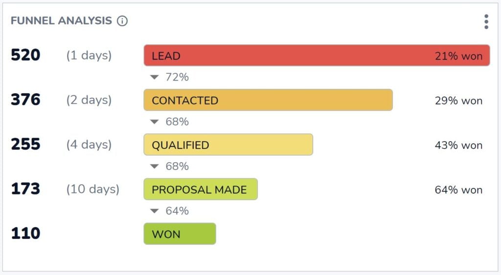
Quantas oportunidades chegam ao estágio de vitória? E quantas oportunidades você precisa em cada estágio anterior para obter esse resultado?
É isso que a indispensável análise de funil do Salesflare ajuda você a responder. Você pode encontrar as respostas para essas perguntas essenciais de forma totalmente imediata no painel "Receita" do Salesflare.
Taxa de fechamento por membro da equipe (incorporado)

Se você quiser saber quem é o closer mais eficiente, este é o relatório que você está procurando.
Você pode encontrá-lo no painel "Team" (Equipe) no Salesflare.
# Oportunidades ganhas vs. perdidas por mês (personalizado)

Agora, como sua taxa de fechamento muda ao longo do tempo? E até que ponto ela depende da quantidade total de oportunidades que são ganhas ou perdidas? Talvez em alguns meses você tenha apenas mais leads, mas não necessariamente mais qualificados?
Isso é o que você pode ver ao gerar relatórios sobre oportunidades ganhas e perdidas por mês.
Para criar isso no Salesflare, faça um relatório sobre "oportunidades", aplique o filtro do painel à "data de fechamento", escolha um "gráfico de barras" para representá-lo, meça pelas "oportunidades do #" (eixo x), visualize pela "data de fechamento da oportunidade" (eixo y), segmente por "estágio da oportunidade" e filtre para mostrar apenas os estágios "ganhos OU perdidos" (barra lateral direita).

Principais motivos perdidos (incorporados)

Agora, vamos nos aprofundar no "porquê". Por que as oportunidades são perdidas? Dessa forma, saberemos como melhorar.
Esse relatório é incorporado ao painel "Receita" do Salesflare. Sempre que você marca uma oportunidade como perdida, o Salesflare pergunta qual é o motivo.
Isso a menos que você desative o campo "Motivo da perda" em Configurações > Personalizar campos > Oportunidades > Campos predefinidos, mas recomendamos que você o mantenha ativado! Esse relatório pode ser uma mina de ouro para insights.
Principais motivos de perda por proprietário da oportunidade (personalizado)

A verdade é que pessoas diferentes podem registrar motivos diferentes devido a seus preconceitos. É por isso que também faz sentido relatar os motivos de perda por membro da equipe.
Para criar esse relatório no Salesflare, faça um relatório sobre "oportunidades", aplique o filtro do painel à "data de fechamento", escolha um "gráfico de barras" para representá-lo, meça pelas "oportunidades do #" (eixo x), visualize pelo "motivo da perda da oportunidade" (eixo y) e segmente pelo "proprietário da oportunidade".

5. Painel de controle do ciclo de vendas
Já analisamos nosso desempenho em detalhes, mas e quanto à nossa velocidade? 🏎️

Com que rapidez estamos trabalhando essas oportunidades no pipeline? Quem consegue fechar negócios mais rapidamente? E onde eles geralmente ficam presos?
Duração média do ciclo de vendas (incorporado)

Qual é a duração do seu ciclo de vendas, ou seja, quanto tempo leva, em média, desde a criação de uma oportunidade até o fechamento como ganho?
Esse relatório no painel "Revenue" (Receita) no Salesflare responde exatamente a essa pergunta.
Duração média do ciclo de vendas por proprietário da oportunidade ao longo do tempo (personalizado)

Esse relatório esclarece a rapidez com que diferentes membros da equipe fecham negócios e como isso muda com o tempo.
Para criar esse relatório no Salesflare, gere relatórios sobre "oportunidades", aplique o filtro do painel à "data de fechamento", escolha um "gráfico de barras" para representá-lo, meça pelo "ciclo de vendas de oportunidades" "médio" (eixo x), visualize pela "data de fechamento da oportunidade" (eixo y) e segmente pelo "proprietário da oportunidade".
Depois disso, desmarque a opção "Stack segments" (Empilhar segmentos) nas opções avançadas (role até a parte inferior), pois não faz muito sentido empilhar médias.

Análise de funil
Já não vimos esse relatório antes? Sim, já vimos!
Desta vez, não estamos analisando o desempenho de fechamento, mas estamos dividindo a duração do nosso ciclo de vendas por estágios.
Você pode verificar esse relatório de "análise de funil" no painel "Receita" do Salesflare sempre que quiser saber como cada estágio contribui para a duração total do ciclo de vendas.
6. Painel de atividades de vendas
Até agora, estivemos medindo a produção e o desempenho. Agora, vamos medir a entrada, também conhecida como atividade de vendas! ✉️📞📆

Companheiro de equipe mais ativo (incorporado)

Pergunta simples: quem é o seu colega de equipe mais ativo?
Esse scorecard padrão é incorporado ao painel "Equipe" no Salesflare.
Atividade por colega de equipe: reuniões, chamadas, e-mails (incorporado)

Quer saber como essa atividade se divide?
Divida a atividade por pessoa em e-mails enviados, chamadas feitas e reuniões realizadas com clientes.
O Salesflare rastreia todos os itens acima automaticamente e sabe qual atividade está vinculada a contas/clientes e qual não está.
# Oportunidades quentes (personalizado)

Para saber quantas oportunidades cruzaram um determinado interesse e nível de atividade, este relatório pode ajudar.
No Salesflare, as oportunidades são automaticamente marcadas como "quentes" ou "em chamas" com base em aberturas de e-mail, cliques em links, visitas a sites e atividades de e-mail.
Para criar um relatório no Salesflare para contar o número de leads quentes o tempo todo, faça um relatório sobre "oportunidades", aplique o filtro do painel à "data de fechamento", escolha um "scorecard" para representá-lo, meça pelas "oportunidades do #" e filtre pela "hotness da conta" para contar apenas as oportunidades vinculadas a contas "quentes OU em chamas".
Se você não quiser contar apenas as oportunidades com uma "data de fechamento" no período selecionado, role para baixo até as opções avançadas e marque "Don't apply the dashboard time filter" (Não aplicar o filtro de tempo do painel).

7. Painel de receitas de assinatura
Se você vende assinaturas, é imprescindível ter uma maneira de gerar relatórios sobre a receita de assinaturas.

Não espere nada muito complexo do rastreamento da receita de assinaturas em um CRM. Há soluções especializadas para isso, como ProfitWell, ChartMogul e Baremetrics.
Ainda assim, é ótimo ter alguns relatórios básicos de receita de assinatura em seu CRM.
Vamos dar uma olhada no que é possível. 👇
Receita Mensal Recorrente (MRR) (incorporada, opcional)

Se estiver vendendo um produto SaaS ou outro tipo de produto ou serviço de assinatura, o crescimento da receita recorrente mensal (MRR) pode ser a principal coisa que você está acompanhando.
O Salesflare tem relatórios de MRR incorporados ao painel "Revenue" (Receita). Para que o relatório seja exibido, ative "recurring revenue" (receita recorrente) no pipeline, conforme mostrado abaixo.

MRR por conta (personalizado)

Por último, mas não menos importante, pode ser interessante descobrir quais são suas principais contas em termos de receita recorrente mensal e como cada uma delas contribui.
Para criar esse relatório no Salesflare, crie um relatório sobre "oportunidades", aplique o filtro do painel à "data de fechamento", escolha um "gráfico de barras" para representá-lo, meça pela "soma" da "receita recorrente da oportunidade" (eixo x), visualize pelo "nome da conta" (eixo y) e filtre pelo "estágio" para incluir somente as oportunidades "ganhas" (barra lateral direita).
Magia ✨

Fornecedores de painéis de vendas
Deseja começar a criar alguns dos itens acima e não tem certeza de qual software usar? Aqui estão alguns dos principais fornecedores de painéis de vendas.
Salesflare
Salesflare não apenas torna muito fácil a criação de painéis de vendas. Ele também facilita muito o rastreamento dos dados nos quais você baseará esses painéis.
O software se baseia nas informações já existentes nas caixas de entrada, calendários etc. da equipe de vendas e garante que esses dados sejam facilmente rastreados. Dessa forma, você não pode simplesmente Acompanhe seus leads melhor e gerar mais receita, mas você também pode criar painéis, saber como está se saindo e melhorar de acordo.
Os painéis padrão que cobrem as necessidades mais comuns estão disponíveis no plano Growth ($29-35/usuário/mês) e os painéis e relatórios personalizados podem ser encontrados no plano Pro ($49-55/usuário/mês).
HubSpot
Outro sistema de CRM com fortes recursos de painel de vendas é o HubSpot. A HubSpot oferece um conjunto abrangente de ferramentas que permite que as equipes de vendas criem painéis detalhados. Esses painéis podem rastrear uma variedade de métricas, incluindo desempenho de vendas, gerenciamento de pipeline e interações com clientes. Os painéis da HubSpot são altamente personalizáveis, permitindo que os usuários os adaptem às suas necessidades específicas.
A análise e a previsão de vendas estão disponíveis no plano Sales Hub Professional ($90-100/usuário/mês), enquanto recursos como o acompanhamento de receitas recorrentes só podem ser encontrados no plano Sales Hub Enterprise (a partir de $150/usuário/mês).
Geckoboard
Geckoboard é uma ferramenta de painel dedicada que se integra a várias fontes de dados para fornecer insights em tempo real. Ele foi projetado para ser fácil de usar, com uma interface de arrastar e soltar que facilita a criação de painéis. O Geckoboard suporta integrações com uma ampla gama de sistemas de CRM, ferramentas de marketing e outras fontes de dados, permitindo que as equipes de vendas monitorem os KPIs em tempo real.
O preço começa em $39-49/mês para o plano Essential, que inclui os principais recursos e integrações, enquanto que para integrações de CRM e taxas de atualização de dados mais altas é necessário passar para o plano Pro ($79-99/mês) ou para o plano Scale ($559-699/mês).
Microsoft Power BI
Microsoft Power BI é uma poderosa ferramenta de análise de negócios que oferece visualizações interativas e recursos de business intelligence. Ele permite que os usuários criem painéis que combinam dados de várias fontes, incluindo sistemas de CRM, bancos de dados e planilhas. O Power BI é conhecido por seus recursos robustos de análise e visualização de dados, o que o torna uma opção popular para equipes de vendas que precisam analisar conjuntos de dados complexos.
O preço do Power BI começa com o plano Pro, a $10/usuário/mês, que inclui recursos completos de BI de autoatendimento, e vai até o plano Premium (a partir de $20/usuário/mês) para análises avançadas e implementações em maior escala.
PERGUNTAS FREQUENTES
O que está incluído em um painel de vendas?
Um painel de vendas inclui uma coleção de relatórios e indicadores-chave de desempenho (KPIs) que visualizam suas atividades de vendas e seu desempenho. Normalmente, ele é organizado em temas específicos, como um painel de geração de leads (rastreamento de novas oportunidades), um painel de receita de vendas (rastreamento de negócios e receita conquistados) e um painel de previsão de vendas (previsão de receita futura).
Como faço para criar um painel de vendas?
Para criar um painel de vendas, você normalmente usa um CRM ou uma ferramenta de painel dedicada. O processo envolve a criação de relatórios individuais, selecionando os dados que você deseja medir (por exemplo, oportunidades), escolhendo um tipo de gráfico (como um gráfico de barras ou scorecard), definindo o que mostrar em cada eixo (por exemplo, valor por data) e aplicando filtros (por exemplo, para um período de tempo ou estágio de vendas específico). Esses relatórios são então organizados em uma única exibição de painel.
Quais são os quatro tipos de painéis?
No business intelligence, os painéis são geralmente categorizados em quatro tipos principais:
- Painéis estratégicos: Fornecer uma visão geral de alto nível das metas e do desempenho de longo prazo da empresa para os executivos.
- Painéis analíticos: Usado por analistas de dados para explorar dados, identificar tendências e descobrir percepções.
- Painéis operacionais: Monitore as atividades operacionais em tempo real para acompanhar o desempenho e identificar problemas imediatos. Um painel de atividades de vendas é um ótimo exemplo.
- Painéis táticos: Usado por gerentes de nível médio para acompanhar o desempenho em relação a metas e táticas específicas do departamento.
Como criar um painel de relatório de vendas no Excel?
Para criar um painel de vendas no Excel, primeiro organize todos os seus dados de vendas em uma tabela estruturada. A partir daí, você pode usar tabelas dinâmicas para resumir os dados e criar vários gráficos (como gráficos de barras, gráficos de linhas e gráficos de pizza) a partir desses resumos. Por fim, organize todos esses gráficos em uma única planilha que funcionará como seu painel. Esse processo é manual e exige que você atualize constantemente os dados de origem.
Qual é o melhor CRM para painéis de vendas?
O melhor CRM para painéis de vendas é aquele que não apenas facilita a criação de relatórios, mas também automatiza a coleta de dados que os alimenta. Um CRM como o Salesflare é excelente nisso, pois registra automaticamente as atividades da sua equipe nos e-mails, no calendário e no telefone. Isso garante que os dados em seus painéis sejam sempre precisos e atualizados sem exigir esforço manual, fornecendo insights nos quais você pode confiar.
Oof, essa foi uma longa lista de exemplos de painéis de vendas (e fornecedores)! 😅 As possibilidades são realmente infinitas...
Se você chegou até aqui, parabéns 🙌 Esperamos que tenha encontrado uma boa inspiração para criar mais relatórios e obter insights mais profundos.
Mais alguma coisa que você gostaria de construir ou saber? Basta perguntar à nossa equipe usando o bate-papo em salesflare.com. Estamos aqui para ajudar 😄

Esperamos que você tenha gostado desta postagem. Se gostou, espalhe a notícia!
👉 Você pode seguir @salesflare em Twitter, Facebook e LinkedIn.
Última atualização:
- Os 8 melhores CRMs para startups em 2026 - 15 de junho de 2026
- 8 melhores CRMs simples em 2026 - 29 de abril de 2026
- 7 Principais ferramentas de CRM em 2026 - 29 de abril de 2026